5 Data analysis and visualization in R
Written by Keaka Farleigh on August 5th, 2025
Last updated by Keaka Farleigh on July 24th, 2026
5.1 Purpose
This tutorial will give you an introduction to data analysis and visualization. You will learn how to perform some basic analyses and how to visualize those results. I will assume that you have minimal experience with R and are a beginner user. Please read through the Introduction to R chapter or send me an email if you do not feel comfortable with this tutorial.
5.2 Learning objectives
- Learn how to choose a statistical analysis.
- Learn how to estimate correlation between two variables.
- Learn how to perform linear regression.
- Learn how to perform a t-test.
- Learn best practices for plotting.
- Learn how to make scatter plots.
- Learn how to make boxplots.
- Learn how to make a multipanel figure.
5.4 Programs used in this pipeline
- R (R core team, 2025)
- Rstudio
- tidyverse packages
- plotgardener
Install the tidyverse using the command below.
5.5 Notes on this tutorial
The materials in this tutorial were originally developed as part of the Lambda bioinformatic workshop at Miami University by Dr. Tereza Jezkova and Dr. Alfredo Ascanio. These materials are now presented at Lambda and the Foundations in R workshop at the University of Virginia.
5.6 Overview
This tutorial will be broken into separate sections for data analysis and visualization, respectively. We will walk through the basics of analysis and visualization before working through some examples!
5.7 Data analysis
We analyze data to understand the relationships between variables in our data and extract meaningful insights that help us understand the processes driving those relationships, make decisions, and much more. Without data analysis there is not much for us to visualize or do in a study.
5.7.1 How to choose a statistical method
A critical part of data analysis is making sure that you are using the right method to analyze your data. This depends on the characteristics of your data and what we would like to test. A dataset, for example, may have different types of variables. Some may be numerical values on a continous scale (e.g., temperature), while others may represent different classes (e.g., level of education, land cover type). We will walk through a few commonly used analyses, when they are appropriate, and how to perform them in R.
5.7.2 Correlation
Evaluate the correlation between two variables is a common first step in many studies. Correlations use two continous variables and determines the strength and direction of the relationship between them. If one variable increases with the other then these variables are postively correlated. If one increases when the other decreases they are negatively correlated. Correlations typically range from -1 to 1.
In R, we use the cor function to evaluate the correlation between two variables and the cor.testfunction to test if the correlation is significantly different than 0.
We can ask, for example, are the Sepal and Petal lengths of flowers in the iris dataset correlated? Is this correlation different from 0?
cor(x = iris$Petal.Length, y = iris$Sepal.Length)

cor.test(x = iris$Petal.Length, y = iris$Sepal.Length)
Note that there are different kinds of correlations you can perform. Check out the method argument of the cor and cor.test functions to learn about them.
Now you try
How would you estimate the correlation between Sepal.Width and Sepal.Length? Try it yourself, then reveal the code below.
5.7.3 Regression
Another way to explore the relationship between two variables is regression. Regression can include categorical data, but we will focus on linear regression between two continous variables. Regression is different than correlation because it defines which variable is independent and which is dependent. In terms of analysis, we are asking how changing in the independent variable influences the dependent variable. We then can derive a mathematical equation from this relationship that can be used to predict dependent values given the independent variable value. For example, we could predict house prices based on square footage, business sales given advertising spend, or how long it will take a car to stop given its speed. Regression can be used to determine a cause and effect relationship between two variables, but this can only be done in an extremely controlled setting where absolutely everything else in the environment is controlled and we only change the variable of interest. For this reason, we often do not infer a cause and effect relationship between variables. Now, let’s run a simple regression of our own.
Imagine we have a reason to believe that a flowers sepal length is determined by its petal length. We will build a model where sepal lenght is a function of petal length. We provide a formula Sepal.Length ~ Petal.Length using the column names of the variables we want to use and the data.
lm(formula = Sepal.Length ~ Petal.Length, data = iris)

lm(formula = Sepal.Length ~ Petal.Length, data = iris) %>% summary()
When you run this you will see a few statistics. We are interested in the p-value for each term (Pr(>|t|)), specifically Petal.Length. We see that the relationship between sepal length and petal length is significant. Indicating that as petal length increases, so does sepal length.
Now you try
Suppose we believe that Sepal.Width influences Sepal.Length. Can you build a linear model for this relationship and summarize it? Try it yourself, then reveal the code below.
5.7.4 T-test
Thus far, we have only applied analyses to continous numeric variables. Now we will test for differences between categories using a t-test. T-tests are used to understand if there is a difference between the means of two different groups. For example, if a new drug for weight loss actually results in weight loss, researchers may compare the mean of the group that took the drug to a control group to understand if the treatment group had a lower mean then the control group.
We will test to see if Sepal.length is differt between different iris species. Notice that we filter the data down to two groups and then perform the test using a formula.
iris.filt <- iris %>% filter(Species != 'setosa') %>%
    select(1,5)

t.test(formula = Sepal.Length ~ Species, data = iris.filt)
We see that there is a difference between groups, the mean for virginica is higher than that for versicolor.
Now you try
Is there a difference of mean Sepal.Width between virginica and versicolor? Try it yourself, then reveal the code below.
5.8 Data visualization
Data visualization is a critical step in any study. It can be used in exploratory data analysis as a first step to understand potential relationships in data and to act as a quick quality check to ensure that they data are what you expect. If not, you can do additional investigation to understand if the unexpected patterns are due to an error, or if they are real. Data visualization is also a powerful way to show our results, rather than merely reporting them in text. Thus, visualizing data should be a first and last step in any study. We will walk through some plotting best practices before generating a couple of the most commonly used plots. Don’t be afraid to explore the different kinds of plots! Just make sure that every plot you make has a clear message that helps the reader understand your results.
5.8.1 Plotting best-practices
There are a few plotting best-practices. This varies from person to person, but I have listed a couple below.
- Always label your axes, including units. Labelled axes allow readers to understand what they are looking at and provides clarity.
- Dependent variables generally go on the y-axis. This is a standard practice and it is done because it shows how the dependent variable changes in response to the independent variable.
- Try multiple plot types. Different types of plots can tell different stories using the same data, consider what you want your plot to convey.
- Draw you plot on paper. This helps you think about what you want the reader to take away from the plot and is a quick alternative to spending a lot of time writing code for each plot type. This does not have to be precise in terms of data, it is just to help you think.
- Avoid complexity and redundancy. Keeping the plot simple helps your plot remain clear. Extra information increases the chance that your reader will get off track.
5.8.2 What is ggplot2?
We will use the R package ggplot2 to make our plots. While base R can make plots, ggplot2 is the standard package for many researchers as it enables you to make any plot you wish. This also means it is a little complicated, but the examples we walk through below will get you started on the right path.
The most important thing to understand about ggplot2 is that is builds plots in layers. You will create a plot with the ggplot function. Then you will add layers on top of this plot, such as points geom_point or boxplots geom_boxplot.
5.8.3 Scatterplot
Scatterplots are used to visualize the relationships between two numeric variables. Each data point is visualized as a dot. Scatterplots can be useful when we have tested the correlation between two variables or built a linear model. Let’s make one using the iris data.
In this code, we will create a plot ggplot(data = iris) and then add a point layer geom_point(aes(x = Sepal.Length, y = Petal.Length)). We also label the axes with xlab and ylab, including the units.
ggplot(data = iris) + geom_point(aes(x = Sepal.Length, y = Petal.Length)) + xlab("Sepal Length (cm)") + ylab("Petal Length (cm)")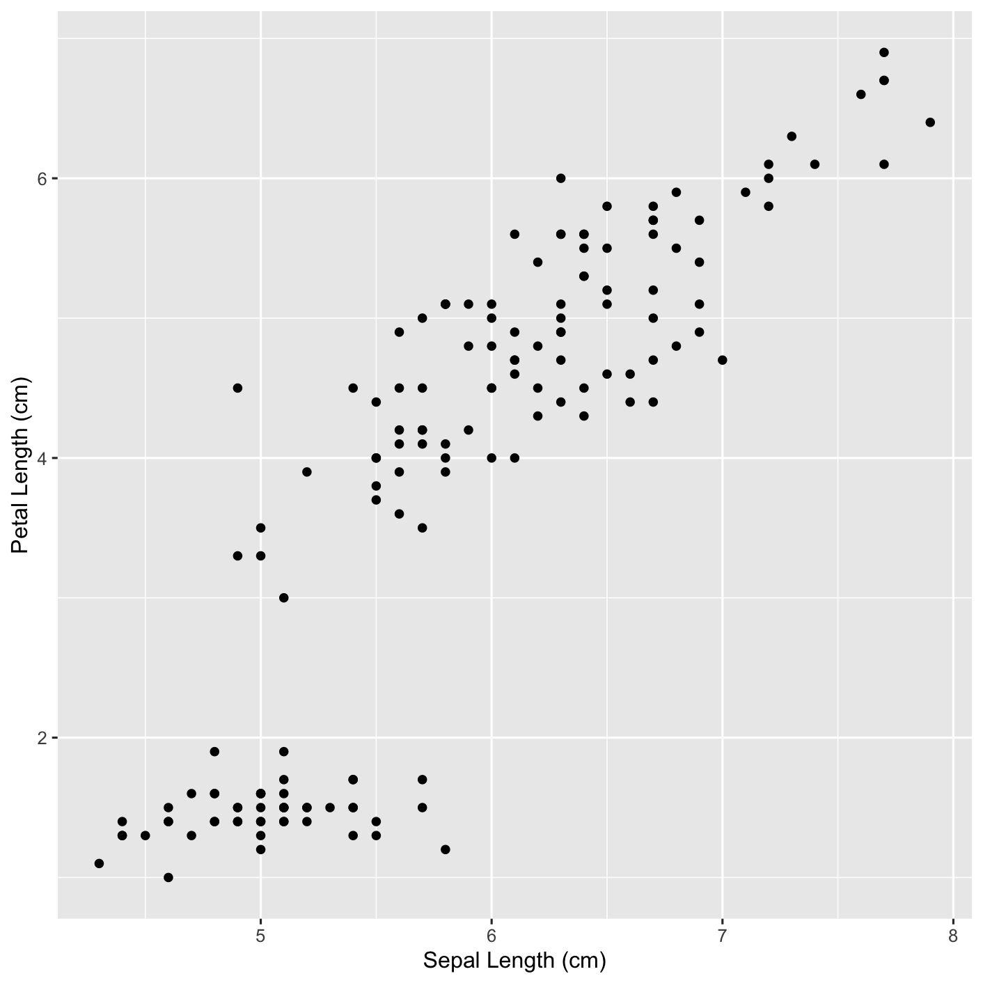
Now let’s add some color. We will color the points by species.
scatter_PLvsSL <- ggplot(data = iris) + geom_point(aes(x = Sepal.Length, y = Petal.Length, colour = Species)) + xlab("Sepal Length (cm)") + ylab("Petal Length (cm)")

scatter_PLvsSL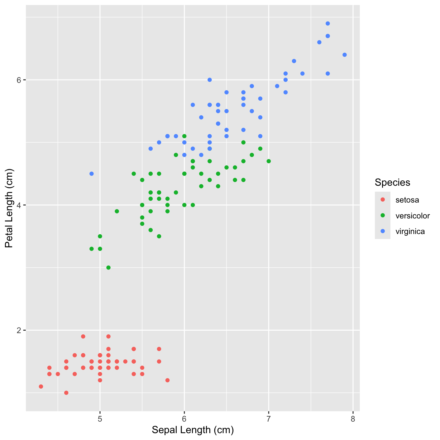
Now you try
Can you change the colors of the different species? Hint, look up scale_color_manual.Try it yourself, then reveal the code below.
Click to show solution
scatter_PLvsSL_color <- ggplot(data = iris) + geom_point(aes(x = Sepal.Length, y = Petal.Length, colour = Species)) + xlab("Sepal Length (cm)") + ylab("Petal Length (cm)") + scale_color_manual(values = c("red", "purple", "blue"))

scatter_PLvsSL_color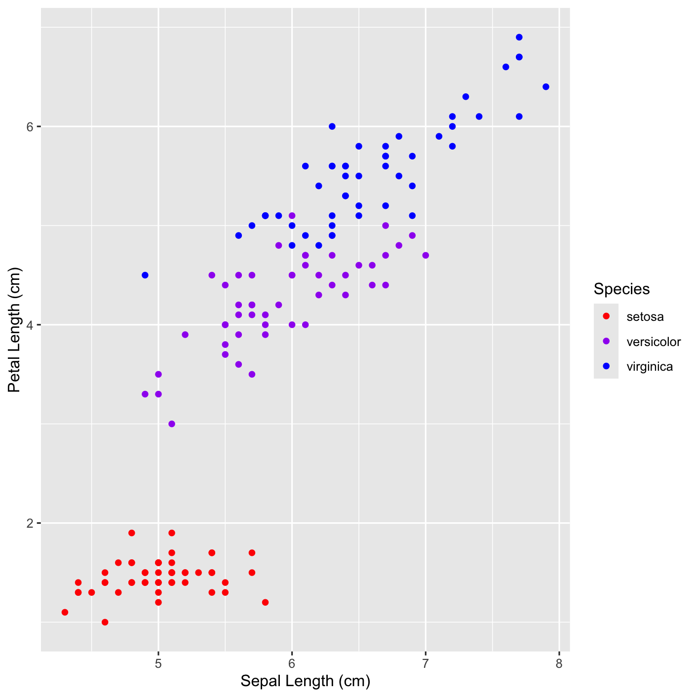
Notice that when we color the points by species we see that Petal.Length seems to be different between setosa and the other species. A better way to visualize this would be to use a boxplot, we will do that below.
5.8.4 Boxplot
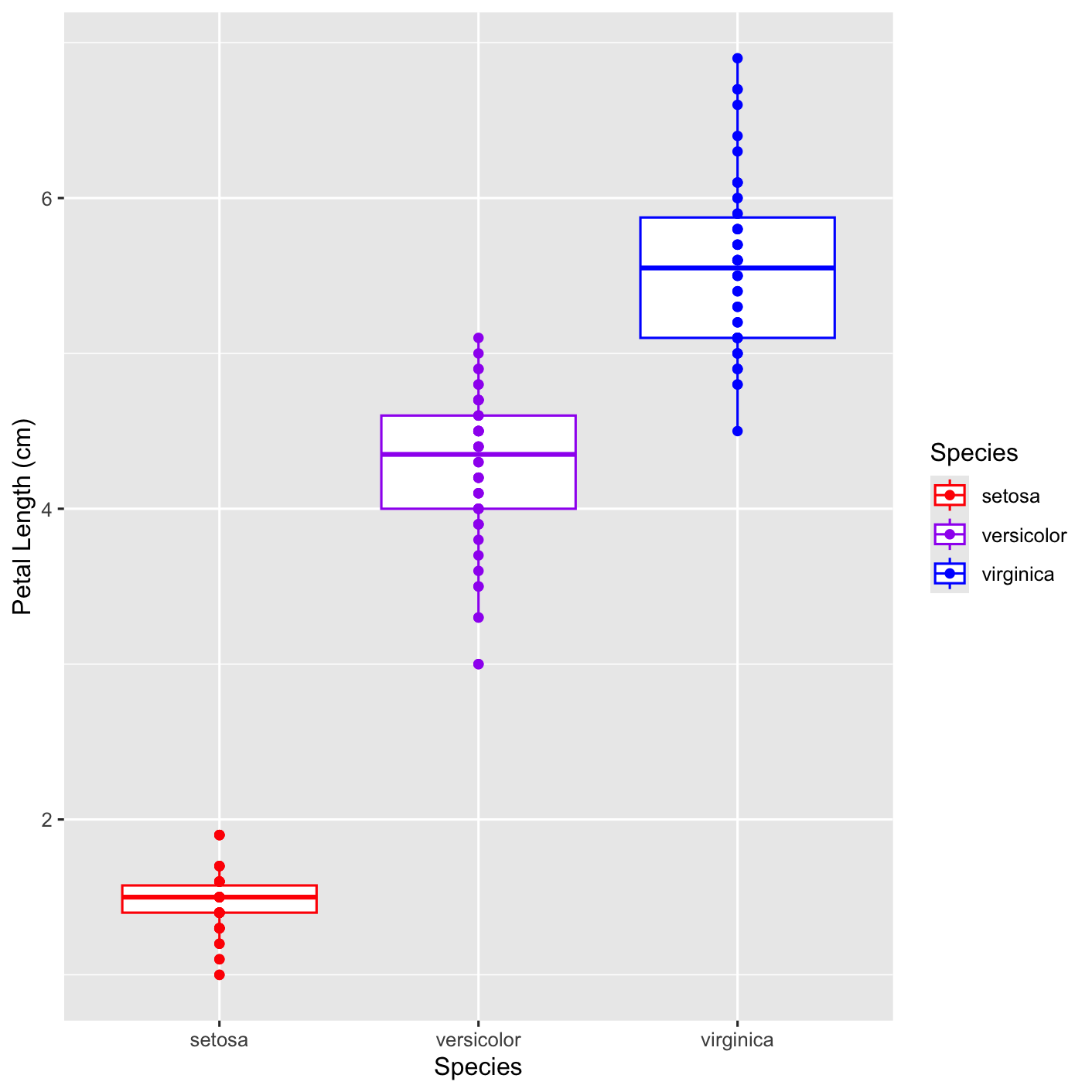
We will make a boxplot which is best used when there are single numerical variables. Boxplots are often used when you want to show the difference (or similarity) between two groups. We will use the geom_boxplot. We will still include a point layer with geom_point so that we display our raw data along with the boxplots. Notice that we have moved the aes argument into the ggplot function and placed the geom_point function after geom_boxplot. This tells ggplot2 to use the plotting attributes established in ggplot(data = iris, aes(x = Species, y = Petal.Length)) for the entire plot and to put the point layer on top of the boxplots.
boxplot_PL <- ggplot(data = iris, aes(x = Species, y = Petal.Length)) + geom_boxplot() + geom_point() +  xlab("Species") + ylab("Petal Length (cm)")

boxplot_PL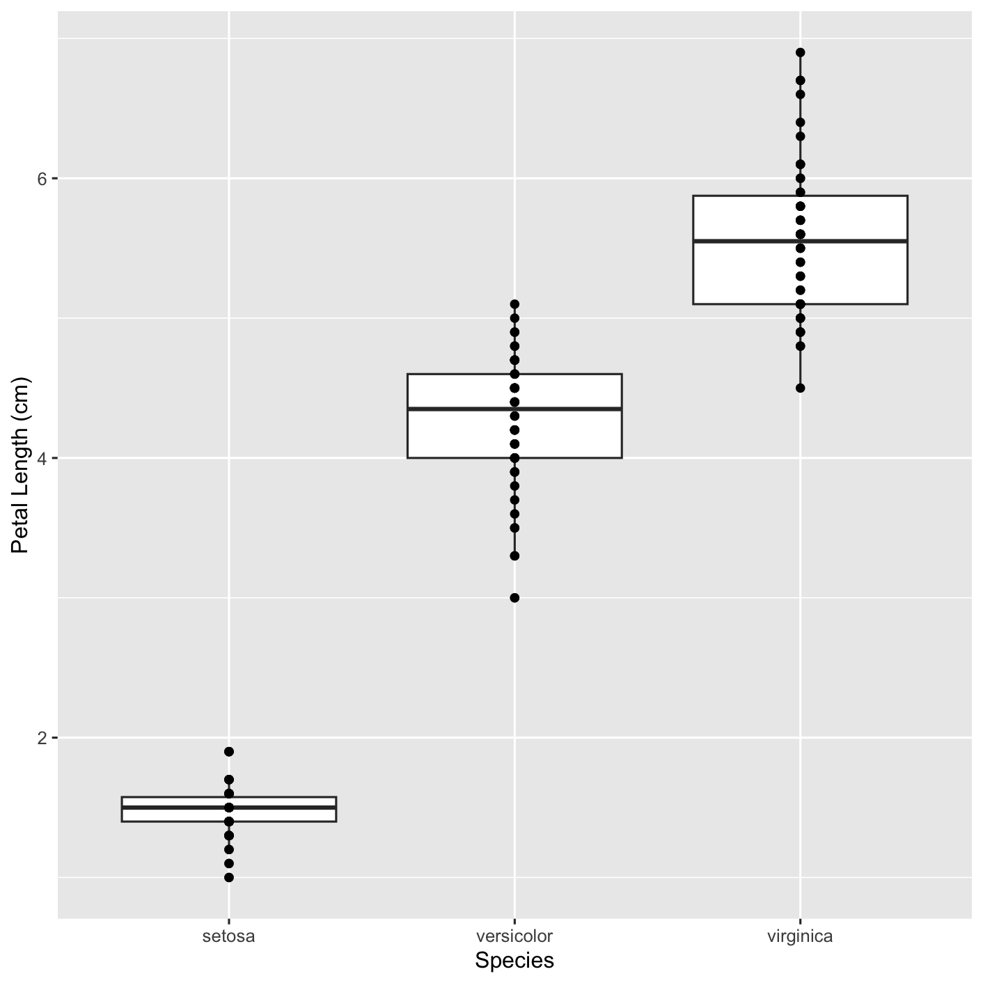
Now you try
Can you change the colors of the different species like you did for the scatterpots? Hint, look up scale_color_manual. Try it yourself, then reveal the code below.
5.8.5 Multipanel figure
We will use plotgardener(Kramer et al., 2022) to make a multipanel figure. Multipanel figures are commonly used in studies and allow us to package different, but related plots into a single figure. In plotgardener, we will first create a page of dimensions that we define using pageCreate, then we will place each of our plots onto that page using plotGG. We specify where we want to place the plots on the page using the x and y arguments, respectively. We defined the size of each plot using width and height, this makes it useful to control the aspect ratio of plots. The defauly units are inches.
We will make sure this saves as a pdf by first opening a pdf, creating our figure in that pdf then closing the pdf.
We will plot the scatterplot next to the boxplot.
# create pdf
pdf("multipanel_figure.pdf", width = 11, height = 8.5)

# Make page
pageCreate(width = 11, height = 8.5, showGuides = FALSE)

# Scatter plot
plotGG(scatter_PLvsSL, x = 0.1, y = 0.1, width = 4, height = 4)

# Scatter plot
plotGG(boxplot_PL, x = 4.2, y = 0.1, width = 4, height = 4)

# Close the connection
dev.off()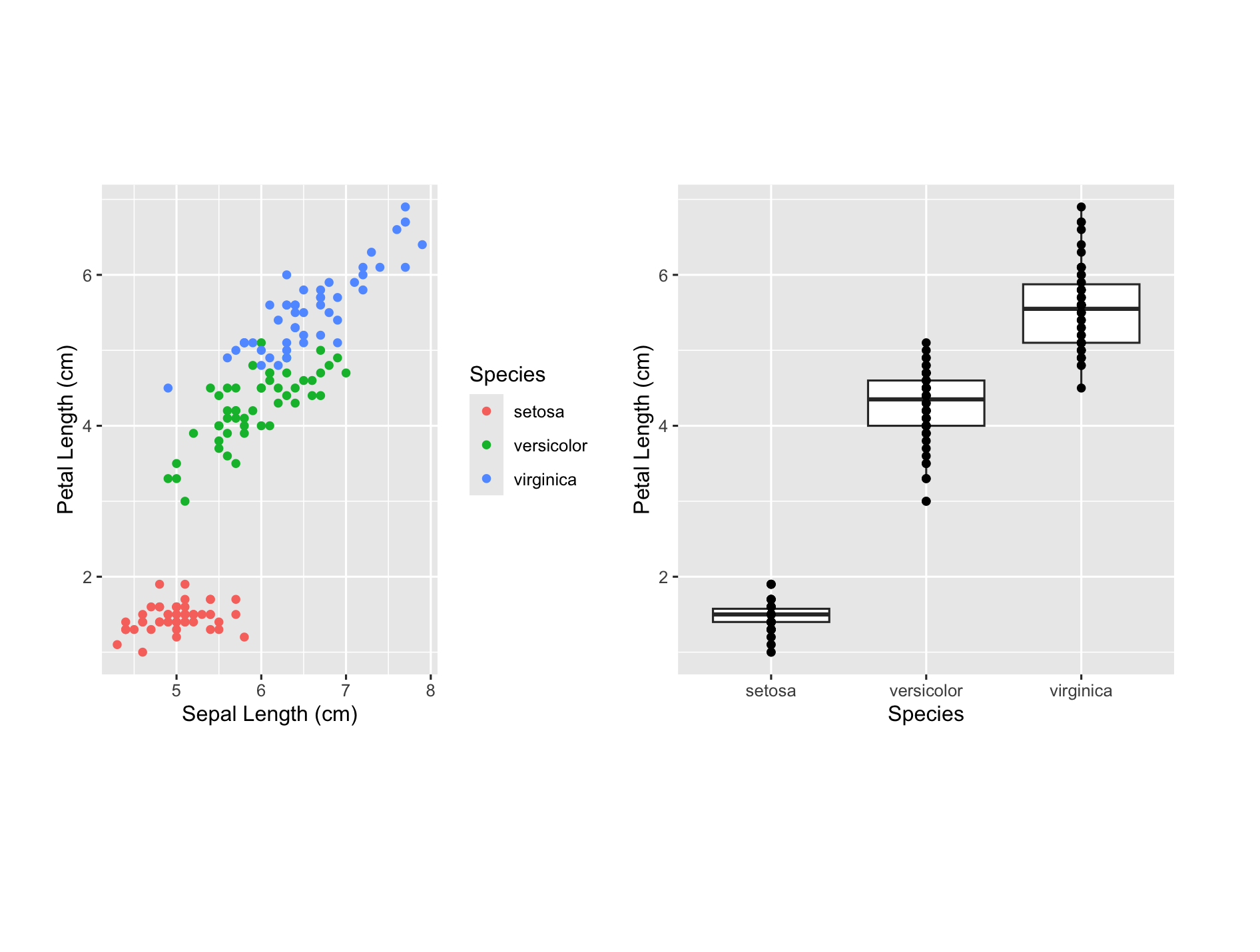
Now you try
Can you replace the plots with the plots colored by species? Hint, we have made these throughout this chapter. Try it yourself, then reveal the code below.
Click to show solution
boxplot_PL_color <- ggplot(data = iris, aes(x = Species, y = Petal.Length, color = Species)) + geom_boxplot() + geom_point() +  xlab("Species") + ylab("Petal Length (cm)") + scale_color_manual(values = c("red", "purple", "blue"))

# create pdf
pdf("multipanel_figure_v2.pdf", width = 11, height = 8.5)

# Make page
pageCreate(width = 11, height = 8.5, showGuides = FALSE)

# Scatter plot
plotGG(scatter_PLvsSL_color, x = 0.1, y = 0.1, width = 4, height = 4)

# Scatter plot
plotGG(boxplot_PL_color, x = 4.2, y = 0.1, width = 4, height = 4)

# Close the connection
dev.off()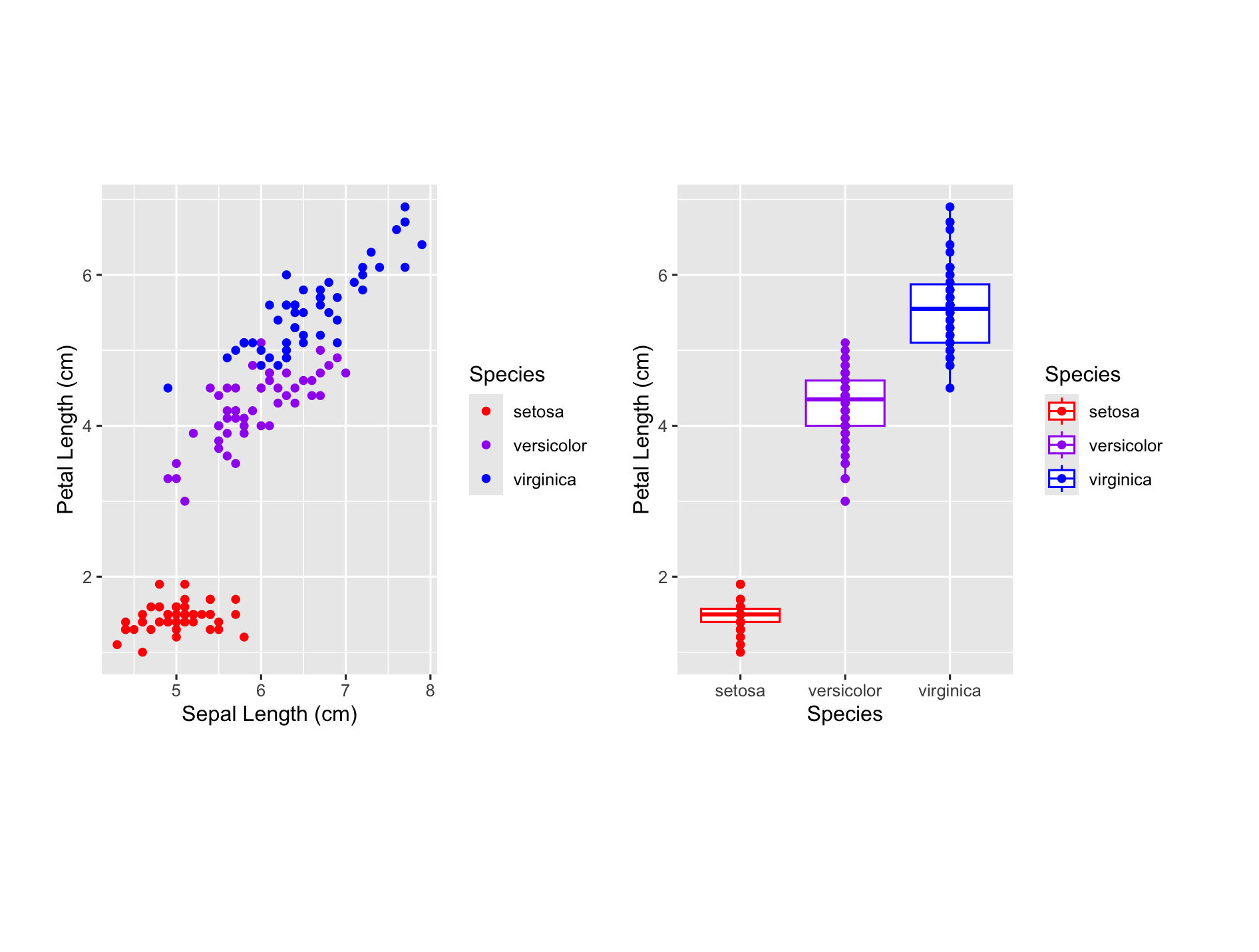
We are done! As always, please reach out with any questions or suggestions.
5.9 References
Kramer, N. E., Davis, E. S., Wenger, C. D., Deoudes, E. M., Parker, S. M., Love, M. I., & Phanstiel, D. H. (2022). Plotgardener: cultivating precise multi-panel figures in R. Bioinformatics, 38(7), 2042-2045.
R Core Team (2025). R: A language and environment for statistical computing. R Foundation for Statistical Computing, Vienna, Austria. https://www.R-project.org/.
Wickham, H., et al. (2019). Welcome to the tidyverse. Journal of Open Source Software, 4(43), 1686. https://doi.org/10.21105/joss.01686