Purpose
This document contains code and results from stress testing the visualization functions of PopGenHelpR (PGH). This allows us to catch any potential errors before publishing the new version of PGH to the CRAN.
!!! WARNING !!!
This document is not pretty, it exists to demonstrate that we have tested many different combinations of arguments in our functions and that they work as expected. Prettier documents can be found in other articles on the PopGenHelpR website.
Load data and packages
# Install developmental PopGenHelpR if needed
devtools::install_github("kfarleigh/PopGenHelpR")
## Warning: `install_github()` was deprecated in devtools 2.5.0.
## ℹ Please use pak::pak("user/repo") instead.
## This warning is displayed once per session.
## Call `lifecycle::last_lifecycle_warnings()` to see where this warning was
## generated.## Using github PAT from envvar GITHUB_PAT. Use `gitcreds::gitcreds_set()` and unset GITHUB_PAT in .Renviron (or elsewhere) if you want to use the more secure git credential store instead.## Downloading GitHub repo kfarleigh/PopGenHelpR@HEAD##
## ── R CMD build ─────────────────────────────────────────────────────────────────
## * checking for file ‘/tmp/RtmpYqwqJ0/remotes21ee1e92c598/kfarleigh-PopGenHelpR-eef6534/DESCRIPTION’ ... OK
## * preparing ‘PopGenHelpR’:
## * checking DESCRIPTION meta-information ... OK
## * checking for LF line-endings in source and make files and shell scripts
## * checking for empty or unneeded directories
## * building ‘PopGenHelpR_1.4.2.tar.gz’## Installing package into '/home/runner/work/_temp/Library'
## (as 'lib' is unspecified)
base::system("R --no-save")

library(PopGenHelpR)
library(cowplot)
library(magrittr)


# Data

Q_dat <- PopGenHelpR::Q_dat
Pop_dat <- PopGenHelpR::HornedLizard_Pop
Fst_dat <- PopGenHelpR::Fst_dat
Het_dat <- PopGenHelpR::Het_dat


# Spatial data
shapefiles <-  system.file("extdata", package = "PopGenHelpR") |> list.files(pattern = "*.shp$", full.names = T)

# Remove the viridis shapefile
shapefiles <- shapefiles[1:8]

# Get elevation data
raster <- geodata::elevation_global(path = tempdir(), res = 5)
## Cached as: /tmp/RtmpYqwqJ0/elevation/wc2.1_5m//wc2.1_5m_elev.zip
# Get temperature data
temp_ras <- geodata::worldclim_global("tavg", path = tempdir(), res = 5)
## Cached as: /tmp/RtmpYqwqJ0/climate/wc2.1_5m//wc2.1_5m_tavg.zipAncestry barchart
We have updated the ancestry barchart to allow users to specify the order of individuals/populations and to handle a mix of characters and numeric information for the population and individual names. It also no longer requires the population assignment file to be four columns, just two (individual and population). The function also sorts individuals/populations by cluster if no order is specified.
# Isolate the q-matrix and population information, create Pop_mix to show it works with a mixture of character and numerics.
Qmat <- Q_dat[[1]]
Pops <- Q_dat[[2]]

Pops_mix <- Pops
Pops_mix$Sample <- as.character(Pops_mix$Sample)
Generate ancestry matrices with mixed individual and population labels.
First, we will show that using a mixture of character and numeric labels does not make a difference, and that PGH now sorts the ancestry matrix to cluster indviduals with similar ancestry together. We expect these plots to look exactly the same.
# Run with no order specifiied
Base <- Ancestry_barchart(anc.mat = Qmat, pops = Pops, K = 5, col = c('#d73027', '#fc8d59', '#e0f3f8', '#91bfdb', '#4575b4'))
## [1] "All information needed is present, moving onto plotting."
## [1] "Want to change the the text size, font, or any other formatting? See https://kfarleigh.github.io/PopGenHelpR/articles/PopGenHelpR_plotformatting.html for examples and help."
Mix_char_num <- Ancestry_barchart(anc.mat = Qmat, pops = Pops_mix, K = 5, col = c('#d73027', '#fc8d59', '#e0f3f8', '#91bfdb', '#4575b4'))## [1] "All information needed is present, moving onto plotting."
## [1] "Want to change the the text size, font, or any other formatting? See https://kfarleigh.github.io/PopGenHelpR/articles/PopGenHelpR_plotformatting.html for examples and help."
plot_grid(Base$`Individual Ancestry Plot`, Mix_char_num$`Individual Ancestry Plot`, ncol = 1)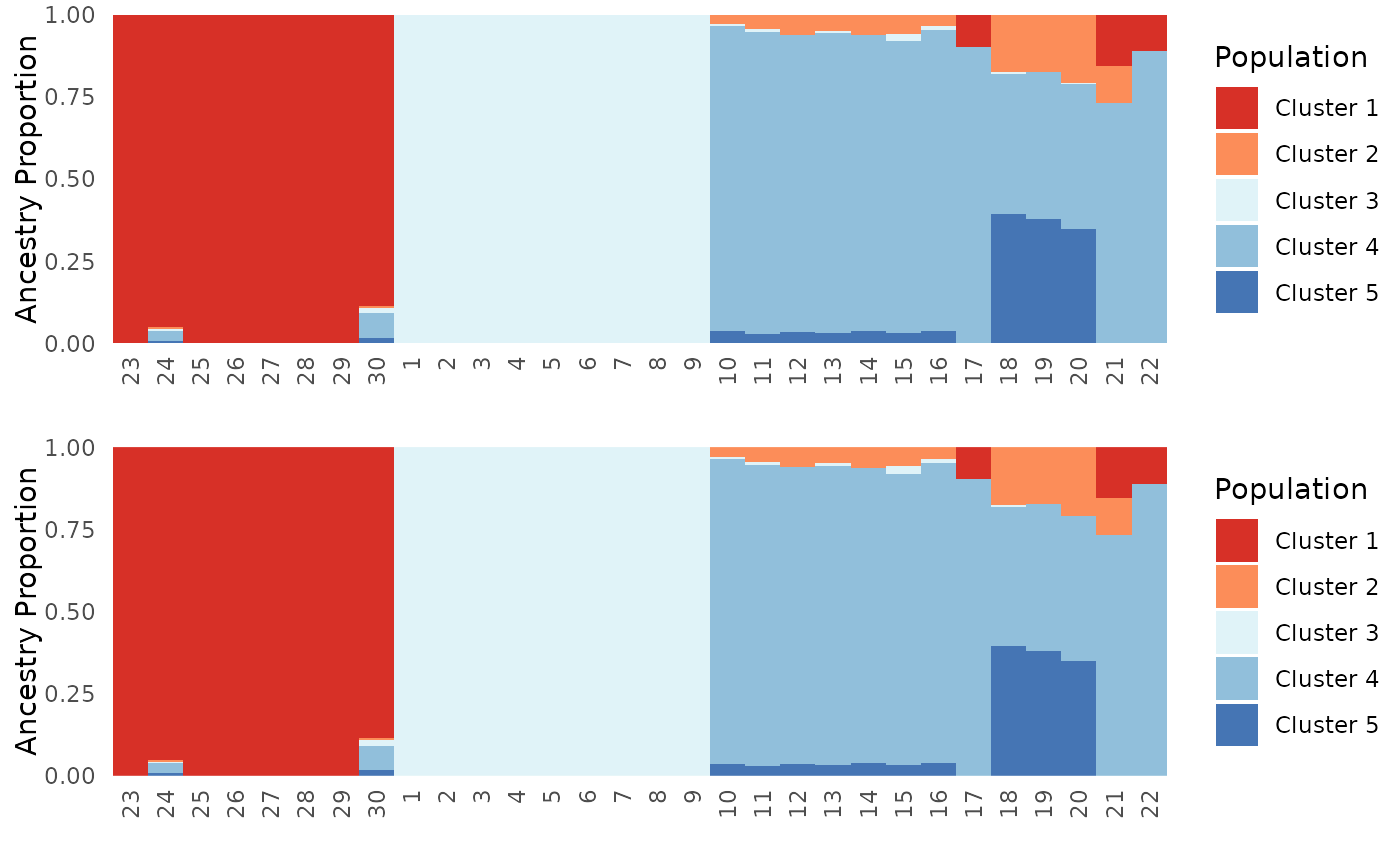
plot_grid(Base$`Population Ancestry Plot`, Mix_char_num$`Population Ancestry Plot`, ncol = 1)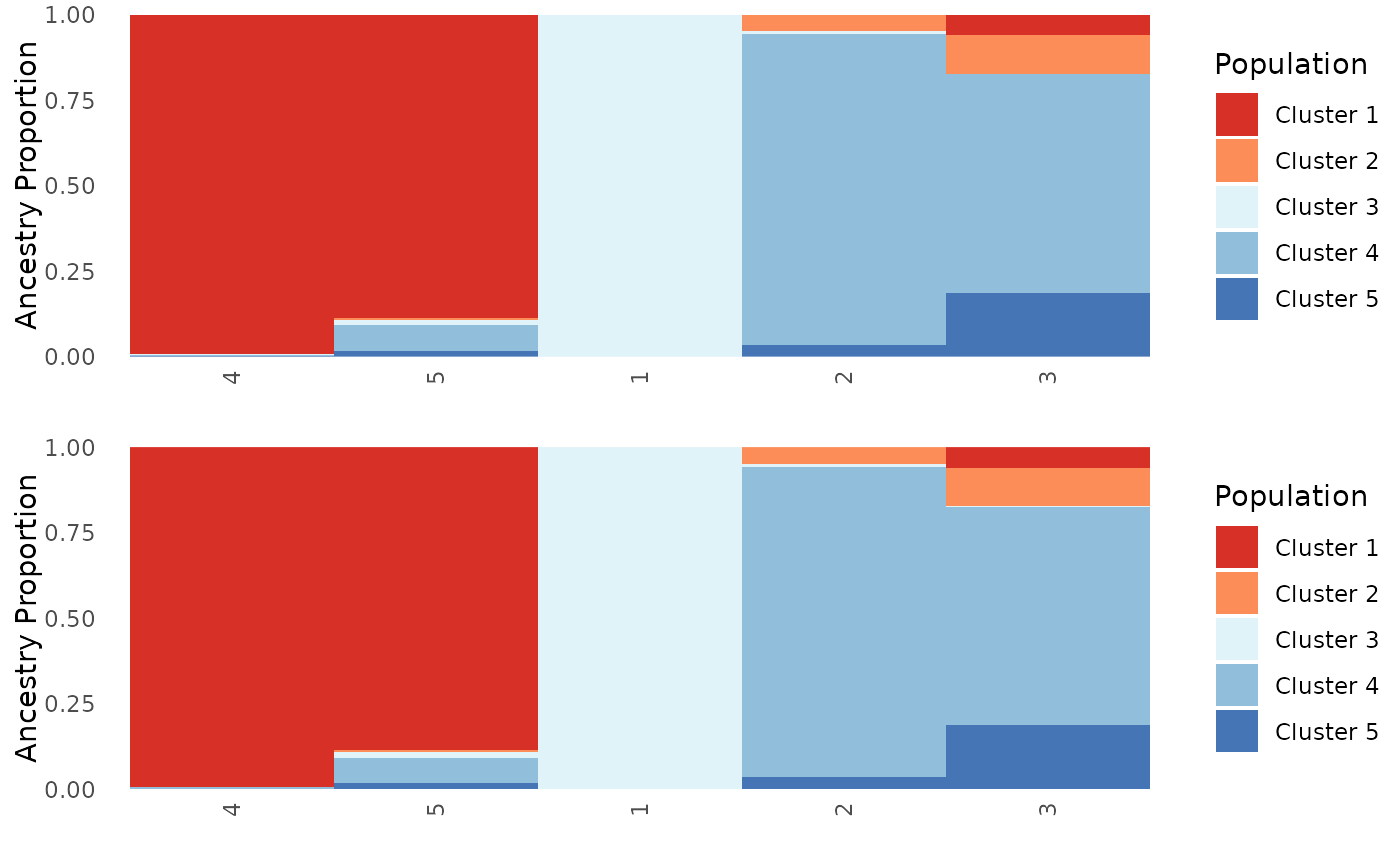
Generate ancestry matrices of specific plot types.
Next, we will test the plot.type argument to ensure that
results are consistent regardless of plot.type.
# Make sure it works for only individual and population plot types

Base_ind <- Ancestry_barchart(anc.mat = Qmat, pops = Pops, K = 5, col = c('#d73027', '#fc8d59', '#e0f3f8', '#91bfdb', '#4575b4'), plot.type = "individual")
## [1] "Want to change the the text size, font, or any other formatting? See https://kfarleigh.github.io/PopGenHelpR/articles/PopGenHelpR_plotformatting.html for examples and help."
Base_ind$`Individual Ancestry Matrix`
Base_pop <- Ancestry_barchart(anc.mat = Qmat, pops = Pops, K = 5, col = c('#d73027', '#fc8d59', '#e0f3f8', '#91bfdb', '#4575b4'), plot.type = "population")## [1] "All information needed is present, moving onto plotting."
## [1] "Want to change the the text size, font, or any other formatting? See https://kfarleigh.github.io/PopGenHelpR/articles/PopGenHelpR_plotformatting.html for examples and help."
Base_pop$`Population Ancestry Matrix`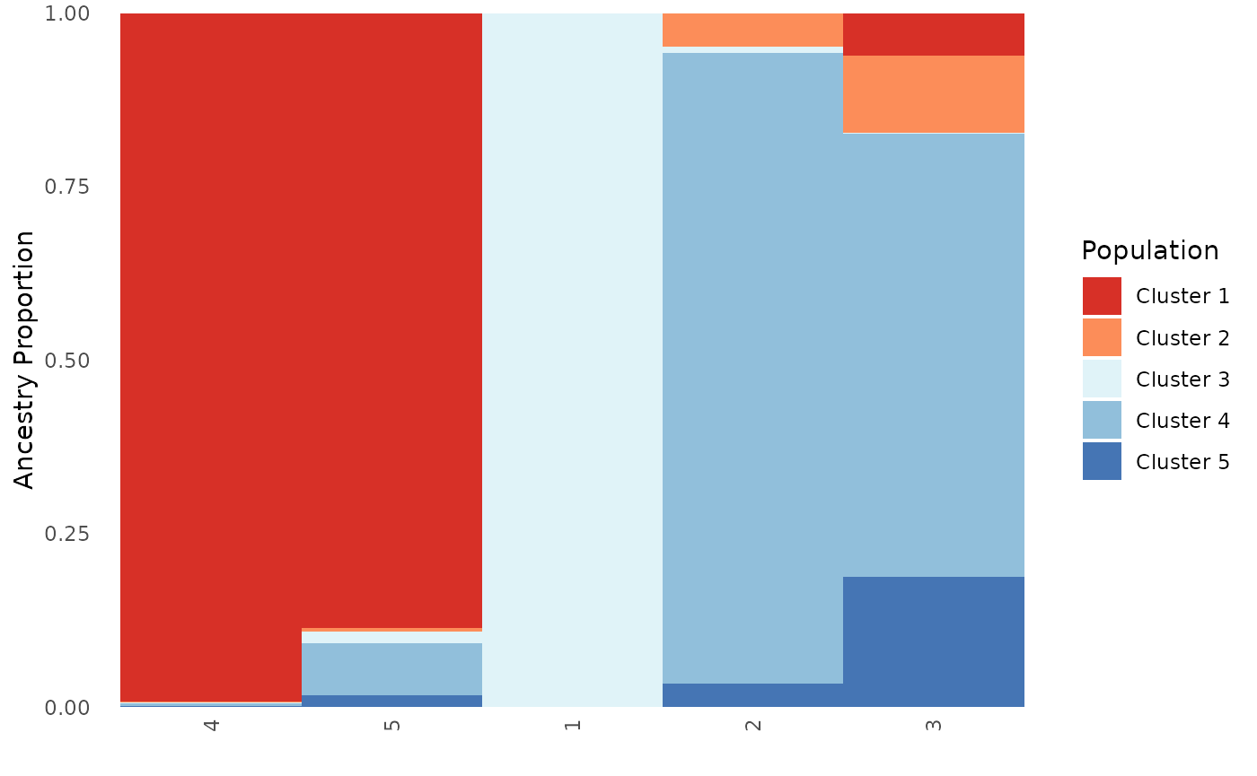
Generate ancestry matrices with specific individual and population ordering.
Finally, we will set individual, population, and both individual and
population orders for plotting to test the ind.order and
pop.order arguments. We expect the individual plots to go
1-30 and for the population plots to go
1-5.
# Order by individual, test when plot type is individual and all

Base_ind_ord <- Ancestry_barchart(anc.mat = Qmat, pops = Pops, K = 5, col = c('#d73027', '#fc8d59', '#e0f3f8', '#91bfdb', '#4575b4'), plot.type = "individual", ind.order = Pops$Sample)
## [1] "Want to change the the text size, font, or any other formatting? See https://kfarleigh.github.io/PopGenHelpR/articles/PopGenHelpR_plotformatting.html for examples and help."
Base_ind_ord$`Individual Ancestry Matrix`
Base_ind_ord <- Ancestry_barchart(anc.mat = Qmat, pops = Pops, K = 5, col = c('#d73027', '#fc8d59', '#e0f3f8', '#91bfdb', '#4575b4'), plot.type = "all", ind.order = Pops$Sample)## [1] "All information needed is present, moving onto plotting."
## [1] "Want to change the the text size, font, or any other formatting? See https://kfarleigh.github.io/PopGenHelpR/articles/PopGenHelpR_plotformatting.html for examples and help."
Base_ind_ord$`Individual Ancestry Matrix`## NULL
# Order by population, test when plot type is population and all

Base_pop_ord <- Ancestry_barchart(anc.mat = Qmat, pops = Pops, K = 5, col = c('#d73027', '#fc8d59', '#e0f3f8', '#91bfdb', '#4575b4'), plot.type = "population", pop.order = unique(Pops$Population))
## [1] "All information needed is present, moving onto plotting."
## [1] "Want to change the the text size, font, or any other formatting? See https://kfarleigh.github.io/PopGenHelpR/articles/PopGenHelpR_plotformatting.html for examples and help."
Base_pop_ord$`Population Ancestry Matrix`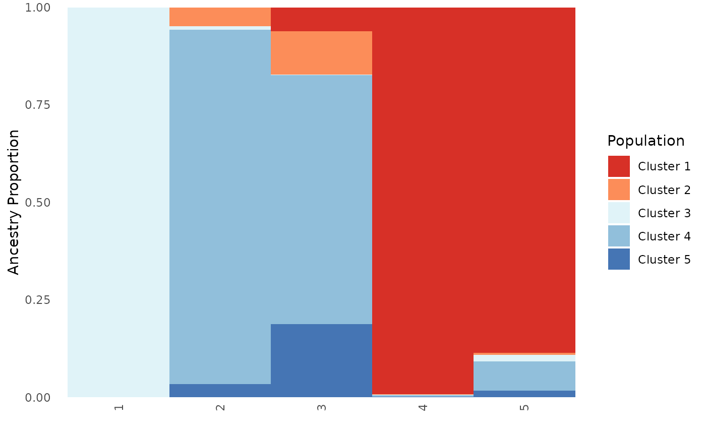
Base_pop_ord <- Ancestry_barchart(anc.mat = Qmat, pops = Pops, K = 5, col = c('#d73027', '#fc8d59', '#e0f3f8', '#91bfdb', '#4575b4'), plot.type = "all", pop.order = unique(Pops$Population))## [1] "All information needed is present, moving onto plotting."
## [1] "Want to change the the text size, font, or any other formatting? See https://kfarleigh.github.io/PopGenHelpR/articles/PopGenHelpR_plotformatting.html for examples and help."
Base_pop_ord$`Population Ancestry Matrix`## NULL
# Specify both an individual and population order, this scenario is only relevant for plot type all

Base_ind_pop_ord <- Ancestry_barchart(anc.mat = Qmat, pops = Pops, K = 5, col = c('#d73027', '#fc8d59', '#e0f3f8', '#91bfdb', '#4575b4'), plot.type = "all", pop.order = unique(Pops$Population), ind.order = Pops$Sample)
## [1] "All information needed is present, moving onto plotting."
## [1] "Want to change the the text size, font, or any other formatting? See https://kfarleigh.github.io/PopGenHelpR/articles/PopGenHelpR_plotformatting.html for examples and help."
# Individual plot
Base_ind_pop_ord$`Individual Ancestry Plot`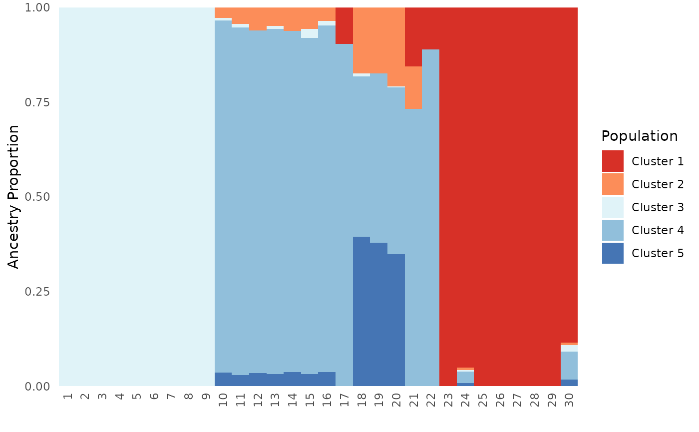
# Population plot
Base_ind_pop_ord$`Population Ancestry Plot`
Let’s move onto the Piechart_map function.
Piechart map
Here, the new functionality is the ability to add shapefiles, a scale bar, and a north arrow to the map. Users can change the position of the shapefile, to be under boundaries (i.e., state lines), ontop of boundaries, and ontop of everything. Note that the shapefiles do not represent the ranges of the species piecharts that are being plotted; this is only to demonstrate functionality. Also, if the shapefile is on top of everything else, it will cause the coordinate system to expand (plot will be sized differently).
Generate original PGH piechart maps
First, we will generate piechart maps without extra layers, a north arrow, or scale bar. We show that PGH works with differnt plot types.
# Make map without shapefiles, this is what the original version of PGH did.
Base_piemap <- Piechart_map(anc.mat = Qmat, pops = Pops, K = 5, col = c('#d73027', '#fc8d59', '#e0f3f8', '#91bfdb', '#4575b4'), plot.type = "all", Lat_buffer = 3, Long_buffer = 3, country_code = c("usa", "can", "mex"))
## Cached as: /tmp/RtmpYqwqJ0/gadm/gadm36_adm0_r5_pk.rds## Cached as: /tmp/RtmpYqwqJ0/gadm/gadm41_USA_1_pk.rds## Cached as: /tmp/RtmpYqwqJ0/gadm/gadm41_CAN_1_pk.rds## Cached as: /tmp/RtmpYqwqJ0/gadm/gadm41_MEX_1_pk.rds## Warning: There was 1 warning in `dplyr::summarise()`.
## ℹ In argument: `dplyr::across(1:(K + 2), mean, na.rm = TRUE)`.
## ℹ In group 1: `Pop = "1"`.
## Caused by warning:
## ! The `...` argument of `across()` is deprecated as of dplyr 1.1.0.
## Supply arguments directly to `.fns` through an anonymous function instead.
##
## # Previously
## across(a:b, mean, na.rm = TRUE)
##
## # Now
## across(a:b, \(x) mean(x, na.rm = TRUE))
## ℹ The deprecated feature was likely used in the PopGenHelpR package.
## Please report the issue at <https://github.com/kfarleigh/PopGenHelpR/issues>.
plot_grid(Base_piemap$Individual_piemap, Base_piemap$Population_piemap, nrow = 1)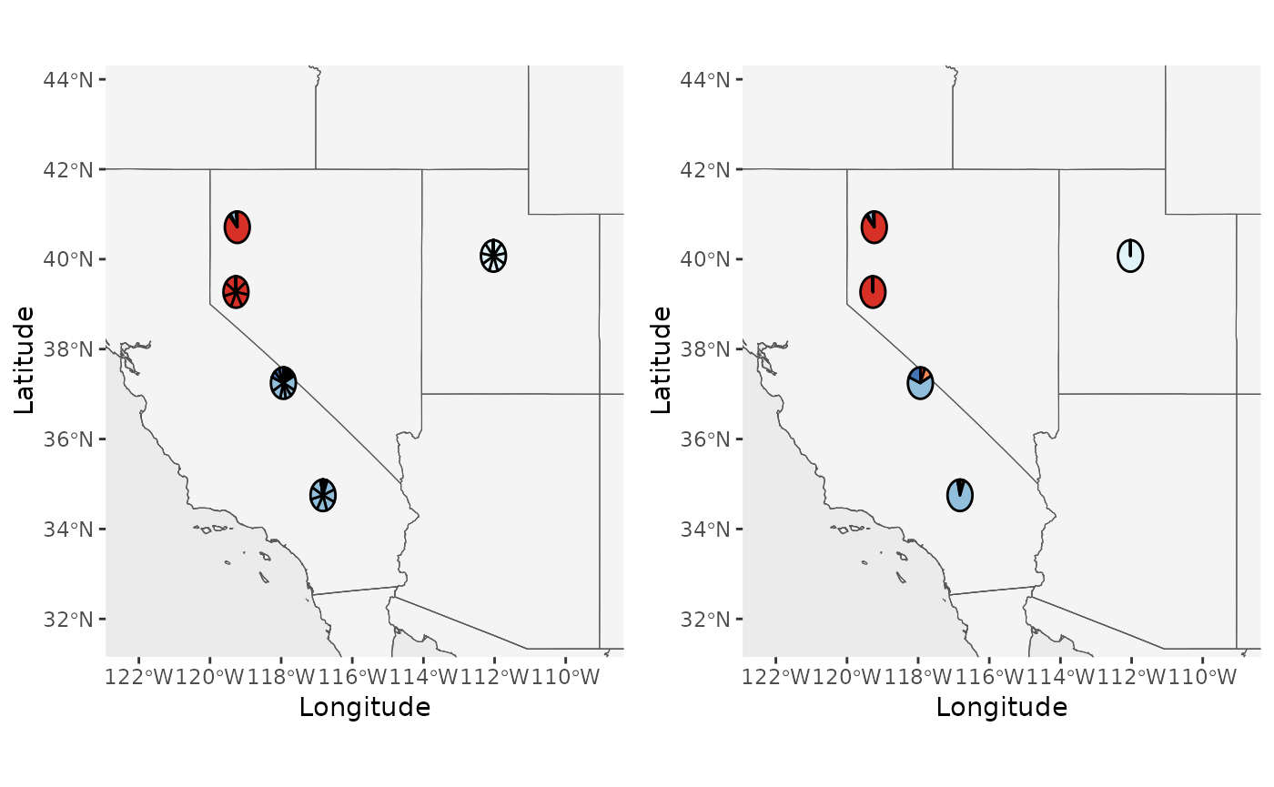
# Show it works for individual and population plot.types
Base_piemap <- Piechart_map(anc.mat = Qmat, pops = Pops, K = 5, col = c('#d73027', '#fc8d59', '#e0f3f8', '#91bfdb', '#4575b4'), plot.type = "individual", Lat_buffer = 3, Long_buffer = 3, country_code = c("usa", "can", "mex"))

Base_piemap$Individual_piemap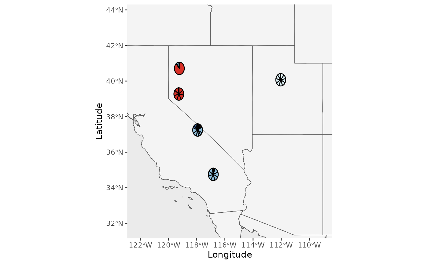
Base_piemap <- Piechart_map(anc.mat = Qmat, pops = Pops, K = 5, col = c('#d73027', '#fc8d59', '#e0f3f8', '#91bfdb', '#4575b4'), plot.type = "population", Lat_buffer = 3, Long_buffer = 3, country_code = c("usa", "can", "mex"))

Base_piemap$Population_piemap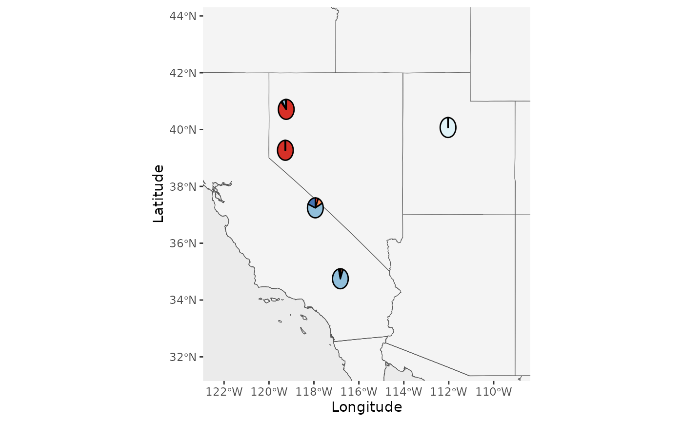
Generate PGH piechart maps with shapefiles, different shapefile positions
Now, we will add shapefiles to the plots and demonstrate how the
shapefile_plot_position argument works. We also demonstrate
how to plot transparent shapefiles that are outlined. It is
expected that you will receive a warning that the scale on the map
varies by more than 10%, scale bar may be inaccurate because the data
are not in a projected coordinate system. We do not support
projection of data within PGH because we do not want to decide which
projection is best for your project and because projecting large
shapefiles and rasters can crash R.
# Try different shapefile positions
Shap_piemap <- Piechart_map(anc.mat = Qmat, pops = Pops, K = 5, col = c('#d73027', '#fc8d59', '#e0f3f8', '#91bfdb', '#4575b4'), plot.type = "all", Lat_buffer = 3, Long_buffer = 3, country_code = c("usa", "can", "mex"), shapefile = shapefiles, shapefile_col = c('#8c510a','#d8b365','#f6e8c3','#f5f5f5','#c7eae5','#5ab4ac','#01665e'), shapefile_plot_position = 1)

Shap1_piemap <- Piechart_map(anc.mat = Qmat, pops = Pops, K = 5, col = c('#d73027', '#fc8d59', '#e0f3f8', '#91bfdb', '#4575b4'), plot.type = "all", Lat_buffer = 3, Long_buffer = 3, country_code = c("usa", "can", "mex"), shapefile = shapefiles, shapefile_col = c('#8c510a','#d8b365','#f6e8c3','#f5f5f5','#c7eae5','#5ab4ac','#01665e'), shapefile_plot_position = 1, north_arrow = T, scale_bar = T, north_arrow_position = "tr")

Shap2_piemap <- Piechart_map(anc.mat = Qmat, pops = Pops, K = 5, col = c('#d73027', '#fc8d59', '#e0f3f8', '#91bfdb', '#4575b4'), plot.type = "all", Lat_buffer = 3, Long_buffer = 3, country_code = c("usa", "can", "mex"), shapefile = shapefiles, shapefile_col = c('#8c510a','#d8b365','#f6e8c3','#f5f5f5','#c7eae5','#5ab4ac','#01665e'), shapefile_plot_position = 2,north_arrow = T, scale_bar = T, north_arrow_position = "tr")

Shap3_piemap <- Piechart_map(anc.mat = Qmat, pops = Pops, K = 5, col = c('#d73027', '#fc8d59', '#e0f3f8', '#91bfdb', '#4575b4'), plot.type = "all", Lat_buffer = 3, Long_buffer = 3, country_code = c("usa", "can", "mex"), shapefile = shapefiles, shapefile_col = c('#8c510a','#d8b365','#f6e8c3','#f5f5f5','#c7eae5','#5ab4ac','#01665e'), shapefile_plot_position = 3,north_arrow = T, scale_bar = T, north_arrow_position = "tr")
## Coordinate system already present.
## ℹ Adding new coordinate system, which will replace the existing one.
## Coordinate system already present.
## ℹ Adding new coordinate system, which will replace the existing one.
plot_grid(Shap1_piemap$Population_piemap, Shap2_piemap$Population_piemap, Shap3_piemap$Population_piemap, nrow = 1)## Scale on map varies by more than 10%, scale bar may be inaccurate
## Scale on map varies by more than 10%, scale bar may be inaccurate
## Scale on map varies by more than 10%, scale bar may be inaccurate
plot_grid(Shap1_piemap$Individual_piemap, Shap2_piemap$Individual_piemap, Shap3_piemap$Individual_piemap, nrow = 1)## Scale on map varies by more than 10%, scale bar may be inaccurate
## Scale on map varies by more than 10%, scale bar may be inaccurate
## Scale on map varies by more than 10%, scale bar may be inaccurate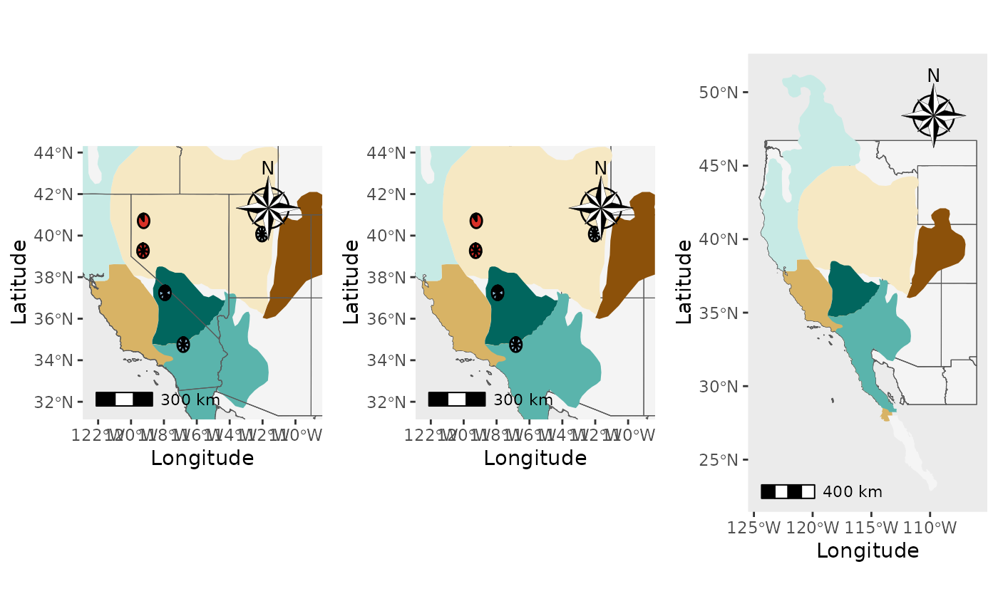
# Make a plot with a transparent shapefile
Shapoutlined_piemap <- Piechart_map(anc.mat = Qmat, pops = Pops, K = 5, col = c('#d73027', '#fc8d59', '#e0f3f8', '#91bfdb', '#4575b4'), plot.type = "all", Lat_buffer = 3, Long_buffer = 3, country_code = c("usa", "can", "mex"), shapefile = shapefiles, shapefile_outline_col = c('#8c510a','#d8b365','#f6e8c3','#f5f5f5','#c7eae5','#5ab4ac','#01665e'), shapefile_col = rep(NA,8), shapefile_plot_position = 2,north_arrow = T, scale_bar = T, north_arrow_position = "tr", shp_outwidth = 2)
plot_grid(Shapoutlined_piemap$Individual_piemap, Shapoutlined_piemap$Population_piemap, nrow = 1)## Scale on map varies by more than 10%, scale bar may be inaccurate
## Scale on map varies by more than 10%, scale bar may be inaccurate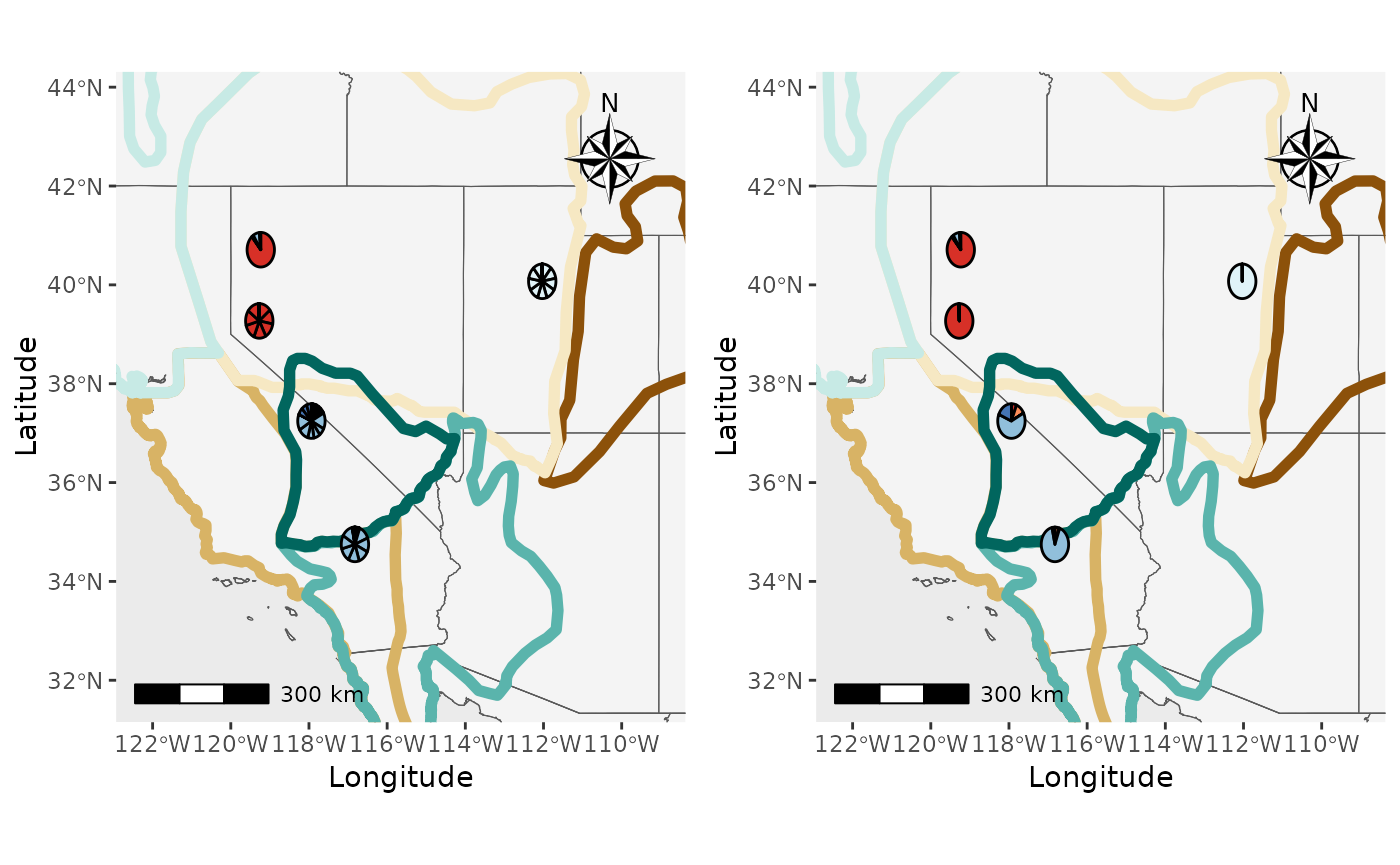
The Piechart_map function also seems to work. Let’s move
onto the Plot_coordinates function.
Plot coordinates
Users can now add shapefiles and rasters to the maps output by
Plot_coordinates, along with north arrows and scale bars.
Now, they can also change the colors of the points based on group
assignment.
First, we will generate a plot with points and no raster or shapefile
as a base layer. We can generate a map where poitns are all the same
color (no group or group_col argument) or a
map where points are colored by specifying the group or
group_col arguments.
Base_PC_nogrp <- Plot_coordinates(dat = Pop_dat, Lat_buffer = 3, Long_buffer = 3, Longitude_col = 3, Latitude_col = 3, country_code = c("usa", "mex", "can"))
Base_PC_wgrp <- Plot_coordinates(dat = Pop_dat, group = Pop_dat$Population, group_col = c('#d73027', '#fc8d59', '#e0f3f8', '#91bfdb', '#4575b4'), Lat_buffer = 3, Long_buffer = 3, Longitude_col = 3, Latitude_col = 3, country_code = c("usa", "mex", "can"))
plot_grid(Base_PC_nogrp, Base_PC_wgrp, nrow = 1)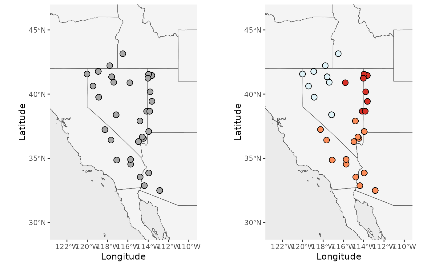
Now, let’s add a shapefile, scale bar, and north arrow.
PC_shp1 <- Plot_coordinates(dat = Pop_dat, Lat_buffer = 3, Long_buffer = 3, Longitude_col = 3, Latitude_col = 4, group = Pop_dat$Population, group_col = c('#d73027', '#fc8d59', '#e0f3f8', '#91bfdb', '#4575b4'), country_code = c("usa", "mex", "can"), shapefile = shapefiles, shapefile_col = c('#8c510a','#d8b365','#f6e8c3','#f5f5f5','#c7eae5','#5ab4ac','#01665e'), shapefile_plot_position = 1,north_arrow = T, scale_bar = T, north_arrow_position = "tr", shapefile_outline_col = NA)
PC_shp2 <- Plot_coordinates(dat = Pop_dat, Lat_buffer = 3, Long_buffer = 3, Longitude_col = 3, Latitude_col = 4, group = Pop_dat$Population, group_col = c('#d73027', '#fc8d59', '#e0f3f8', '#91bfdb', '#4575b4'), country_code = c("usa", "mex", "can"), shapefile = shapefiles, shapefile_col = c('#8c510a','#d8b365','#f6e8c3','#f5f5f5','#c7eae5','#5ab4ac','#01665e'), shapefile_plot_position = 2,north_arrow = T, scale_bar = T, north_arrow_position = "tr", shapefile_outline_col = NA)
PC_shp3 <- Plot_coordinates(dat = Pop_dat, Lat_buffer = 3, Long_buffer = 3, Longitude_col = 3, Latitude_col = 4, group = Pop_dat$Population, group_col = c('#d73027', '#fc8d59', '#e0f3f8', '#91bfdb', '#4575b4'), country_code = c("usa", "mex", "can"), shapefile = shapefiles, shapefile_col = c('#8c510a','#d8b365','#f6e8c3','#f5f5f5','#c7eae5','#5ab4ac','#01665e'), shapefile_plot_position = 3,north_arrow = T, scale_bar = T, north_arrow_position = "tr", shapefile_outline_col = NA)## Coordinate system already present.
## ℹ Adding new coordinate system, which will replace the existing one.
PC_shpout <- Plot_coordinates(dat = Pop_dat, Lat_buffer = 3, Long_buffer = 3, Longitude_col = 3, Latitude_col = 4, group = Pop_dat$Population, group_col = c('#d73027', '#fc8d59', '#e0f3f8', '#91bfdb', '#4575b4'), country_code = c("usa", "mex", "can"), shapefile = shapefiles, shapefile_outline_col = c('#8c510a','#d8b365','#f6e8c3','#f5f5f5','#c7eae5','#5ab4ac','#01665e'), shapefile_col = rep(NA,8), shapefile_plot_position = 3,north_arrow = T, scale_bar = T, north_arrow_position = "tr")## Coordinate system already present.
## ℹ Adding new coordinate system, which will replace the existing one.
plot_grid(PC_shp1, PC_shp2, PC_shp3, PC_shpout, nrow = 2, ncol = 2)## Scale on map varies by more than 10%, scale bar may be inaccurate
## Scale on map varies by more than 10%, scale bar may be inaccurate
## Scale on map varies by more than 10%, scale bar may be inaccurate
## Scale on map varies by more than 10%, scale bar may be inaccurate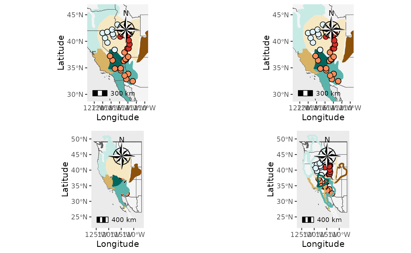
Now, let’s add a raster. Sometimes terra
interprets rasters as discrete, even though they are not. We have added
the disrete_raster argument to accomodate this, but fair
warning that it can throw an error the first time you try your
raster. The solution is just to change the
discrete_raster argument to TRUE or FALSE (depending on
what failed).
PC_ras1 <- Plot_coordinates(Pop_dat, Longitude_col = 3, Latitude_col = 4, group = Pop_dat$Population, group_col = c('#d73027', '#fc8d59', '#e0f3f8', '#91bfdb', '#4575b4'), country_code = c("usa", "mex", "can"), raster = raster, raster_plot_position = 1, interpolate_raster = TRUE, Lat_buffer = 3, Long_buffer = 3, discrete_raster = TRUE,
raster_col = c('white','#ffffcc','#ffeda0','#fed976','#feb24c','#fd8d3c','#fc4e2a','#e31a1c','#bd0026','#800026'), raster_breaks = c(0,500,1000,1500,2000,2500,3000,3500,4000,5000), legend_pos = "right", scale_bar = TRUE, north_arrow_position = "tr", north_arrow = TRUE)
PC_ras2 <- Plot_coordinates(Pop_dat, Longitude_col = 3, Latitude_col = 4, group = Pop_dat$Population, group_col = c('#d73027', '#fc8d59', '#e0f3f8', '#91bfdb', '#4575b4'), country_code = c("usa", "mex", "can"), raster = raster, raster_plot_position = 2, interpolate_raster = TRUE, Lat_buffer = 3, Long_buffer = 3, discrete_raster = TRUE,
raster_col = c('white','#ffffcc','#ffeda0','#fed976','#feb24c','#fd8d3c','#fc4e2a','#e31a1c','#bd0026','#800026'), raster_breaks = c(0,500,1000,1500,2000,2500,3000,3500,4000,5000), legend_pos = "right", scale_bar = TRUE, north_arrow_position = "tr", north_arrow = TRUE)
PC_ras3 <- Plot_coordinates(Pop_dat, Longitude_col = 3, Latitude_col = 4, group = Pop_dat$Population, group_col = c('#d73027', '#fc8d59', '#e0f3f8', '#91bfdb', '#4575b4'), country_code = c("usa", "mex", "can"), raster = raster, raster_plot_position = 3, interpolate_raster = TRUE, Lat_buffer = 3, Long_buffer = 3, discrete_raster = TRUE,
raster_col = c('white','#ffffcc','#ffeda0','#fed976','#feb24c','#fd8d3c','#fc4e2a','#e31a1c','#bd0026','#800026'), raster_breaks = c(0,500,1000,1500,2000,2500,3000,3500,4000,5000), legend_pos = "right", scale_bar = TRUE, north_arrow_position = "tr", north_arrow = TRUE)
plot_grid(PC_ras1, PC_ras2, PC_ras3)## Scale on map varies by more than 10%, scale bar may be inaccurate
## Scale on map varies by more than 10%, scale bar may be inaccurate
## Scale on map varies by more than 10%, scale bar may be inaccurate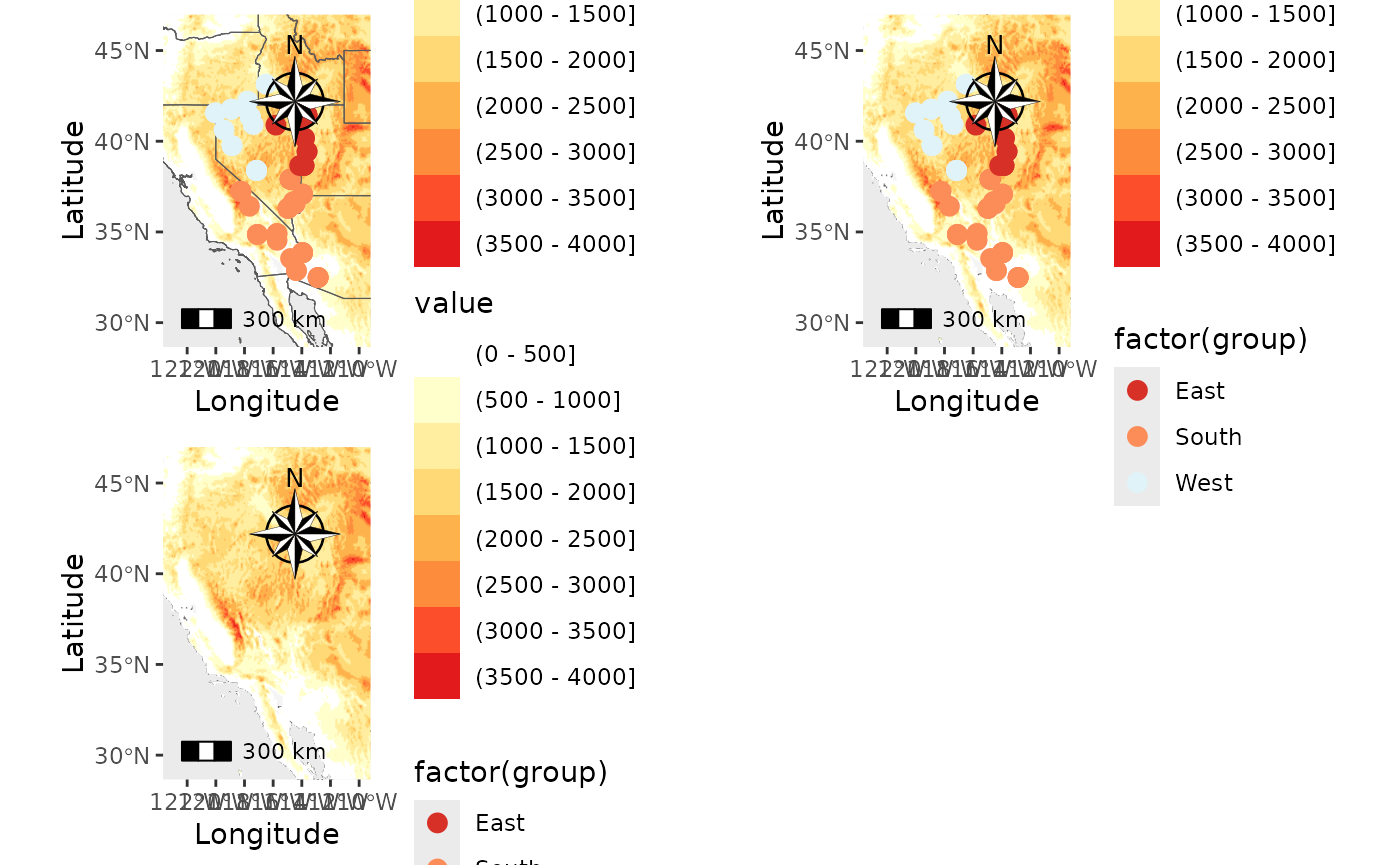
PC_temp <- Plot_coordinates(Pop_dat, Longitude_col = 3, Latitude_col = 4, group = Pop_dat$Population, group_col = c('#d73027', '#fc8d59', '#e0f3f8', '#91bfdb', '#4575b4'), country_code = c("usa", "mex", "can"), raster = raster, raster_plot_position = 3, interpolate_raster = TRUE, Lat_buffer = 3, Long_buffer = 3, discrete_raster = FALSE,
raster_col = c('white','#ffffcc','#ffeda0','#fed976','#feb24c','#fd8d3c','#fc4e2a','#e31a1c','#bd0026','#800026'), legend_pos = "right", scale_bar = TRUE, north_arrow_position = "tr", north_arrow = TRUE)
PC_temp_wbreaks <- Plot_coordinates(Pop_dat, Longitude_col = 3, Latitude_col = 4, group = Pop_dat$Population, group_col = c('#d73027', '#fc8d59', '#e0f3f8', '#91bfdb', '#4575b4'), country_code = c("usa", "mex", "can"), raster = temp_ras, raster_plot_position = 1, interpolate_raster = TRUE, Lat_buffer = 3, Long_buffer = 3, discrete_raster = FALSE,
raster_col = c('white','#ffffcc','#ffeda0','#fed976','#feb24c','#fd8d3c','#fc4e2a','#e31a1c','#bd0026','#800026'), legend_pos = "right", scale_bar = TRUE, north_arrow_position = "tr", north_arrow = TRUE, raster_breaks = c(-15, -10, -5,-2.5, 0,2.5, 5, 10, 15, 20))
plot_grid(PC_temp, PC_temp_wbreaks)## Scale on map varies by more than 10%, scale bar may be inaccurate
## Scale on map varies by more than 10%, scale bar may be inaccurate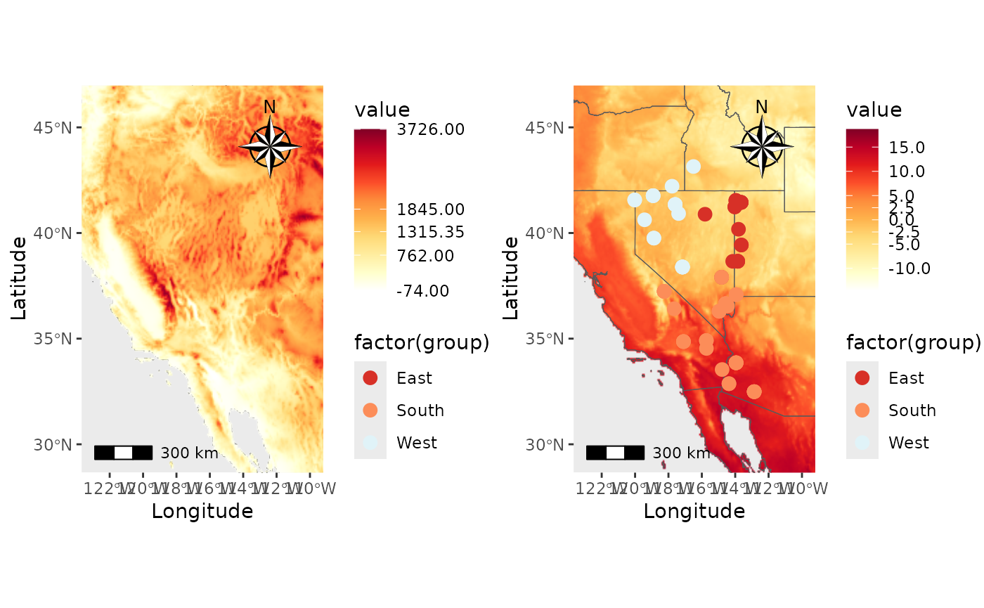
Finally, we will create the map with a raster and shapefiles.
PC_ras_shp <- Plot_coordinates(Pop_dat, Longitude_col = 3, Latitude_col = 4, group = Pop_dat$Population, group_col = c('#d73027', '#fc8d59', '#e0f3f8', '#91bfdb', '#4575b4'), country_code = c("usa", "mex", "can"), shapefile = shapefiles, shapefile_plot_position = 1, raster = raster, raster_plot_position = 2, interpolate_raster = TRUE, Lat_buffer = 3, Long_buffer = 3, discrete_raster = TRUE, shapefile_outline_col = c('#8c510a','#d8b365','#f6e8c3','#f5f5f5','#c7eae5','#5ab4ac','#01665e'), raster_col = c('white','#ffffcc','#ffeda0','#fed976','#feb24c','#fd8d3c','#fc4e2a','#e31a1c','#bd0026','#800026'), raster_breaks = c(0,500,1000,1500,2000,2500,3000,3500,4000,5000), legend_pos = "right", scale_bar = TRUE, north_arrow_position = "tr", north_arrow = TRUE)
PC_ras_shp## Scale on map varies by more than 10%, scale bar may be inaccurate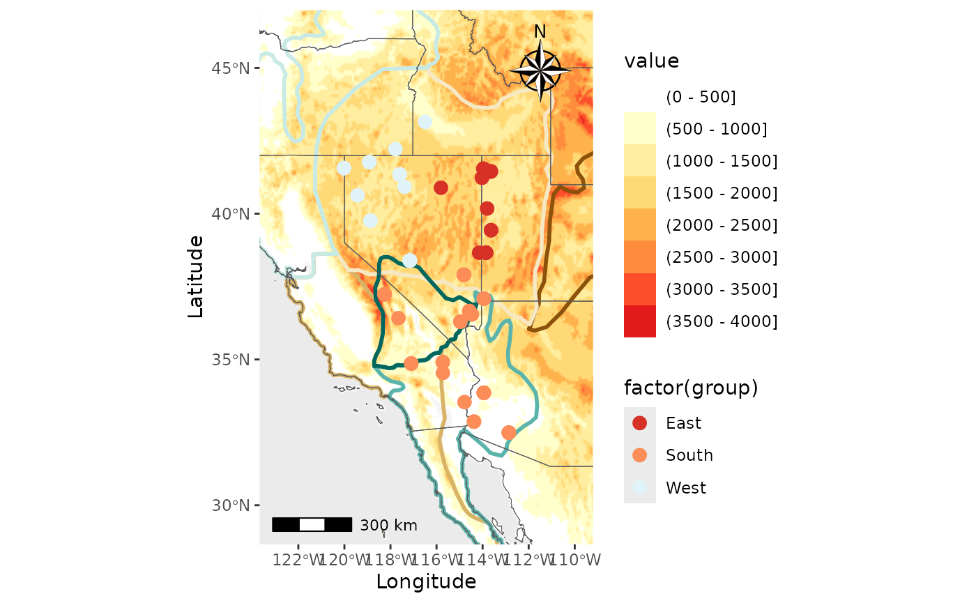
Point map
Users can now add shapefiles and rasters to the maps output by
Point_map, along with north arrows and scale bars.
First, we will just make a Point_map map with no
background, just the regular basemap and administrative boundaries.
Base_PM <- Point_map(dat = Het_dat, statistic = "Heterozygosity", country_code = c("usa", "can", "mex"))
# Set an outline color
Base_PM_out <- Point_map(dat = Het_dat, statistic = "Heterozygosity", country_code = c("usa", "can", "mex"), out.col = "black")
plot_grid(Base_PM$`Heterozygosity Map`, Base_PM_out$`Heterozygosity Map`, nrow = 1)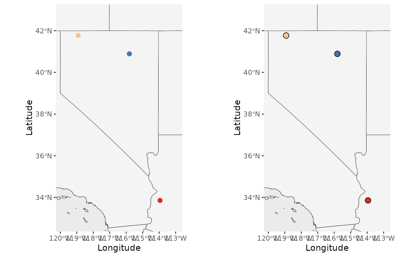
Now let’s add shapefiles, a scale bar, and north arrow.
PM_shp1 <- Point_map(dat = Het_dat, statistic = "Heterozygosity", Lat_buffer = 3, Long_buffer = 3, Longitude_col = 4, Latitude_col = 5, country_code = c("usa", "mex", "can"), shapefile = shapefiles, shapefile_col = c('#8c510a','#d8b365','#f6e8c3','#f5f5f5','#c7eae5','#5ab4ac','#01665e'), shapefile_plot_position = 1,north_arrow = T, scale_bar = T, north_arrow_position = "tr", shapefile_outline_col = NA, out.col = "black")
PM_shp2 <- Point_map(dat = Het_dat, statistic = "Heterozygosity", Lat_buffer = 3, Long_buffer = 3, Longitude_col = 4, Latitude_col = 5, country_code = c("usa", "mex", "can"), shapefile = shapefiles, shapefile_col = c('#8c510a','#d8b365','#f6e8c3','#f5f5f5','#c7eae5','#5ab4ac','#01665e'), shapefile_plot_position = 2,north_arrow = T, scale_bar = T, north_arrow_position = "tr", shapefile_outline_col = NA, out.col = "black")
PM_shp3 <- Point_map(dat = Het_dat, statistic = "Heterozygosity", Lat_buffer = 3, Long_buffer = 3, Longitude_col = 4, Latitude_col = 5, country_code = c("usa", "mex", "can"), shapefile = shapefiles, shapefile_col = c('#8c510a','#d8b365','#f6e8c3','#f5f5f5','#c7eae5','#5ab4ac','#01665e'), shapefile_plot_position = 3,north_arrow = T, scale_bar = T, north_arrow_position = "tr", shapefile_outline_col = NA, out.col = "black")## Coordinate system already present.
## ℹ Adding new coordinate system, which will replace the existing one.
PM_shpout <- Point_map(dat = Het_dat, statistic = "Heterozygosity", Lat_buffer = 3, Long_buffer = 3, Longitude_col = 4, Latitude_col = 5, country_code = c("usa", "mex", "can"), shapefile = shapefiles, shapefile_outline_col = c('#8c510a','#d8b365','#f6e8c3','#f5f5f5','#c7eae5','#5ab4ac','#01665e'), shapefile_col = rep(NA,8), shapefile_plot_position = 3,north_arrow = T, scale_bar = T, north_arrow_position = "tr", out.col = "black")## Coordinate system already present.
## ℹ Adding new coordinate system, which will replace the existing one.
plot_grid(PM_shp1$`Heterozygosity Map`, PM_shp2$`Heterozygosity Map`, PM_shp3$`Heterozygosity Map`, PM_shpout$`Heterozygosity Map`)## Scale on map varies by more than 10%, scale bar may be inaccurate
## Scale on map varies by more than 10%, scale bar may be inaccurate
## Scale on map varies by more than 10%, scale bar may be inaccurate
## Scale on map varies by more than 10%, scale bar may be inaccurate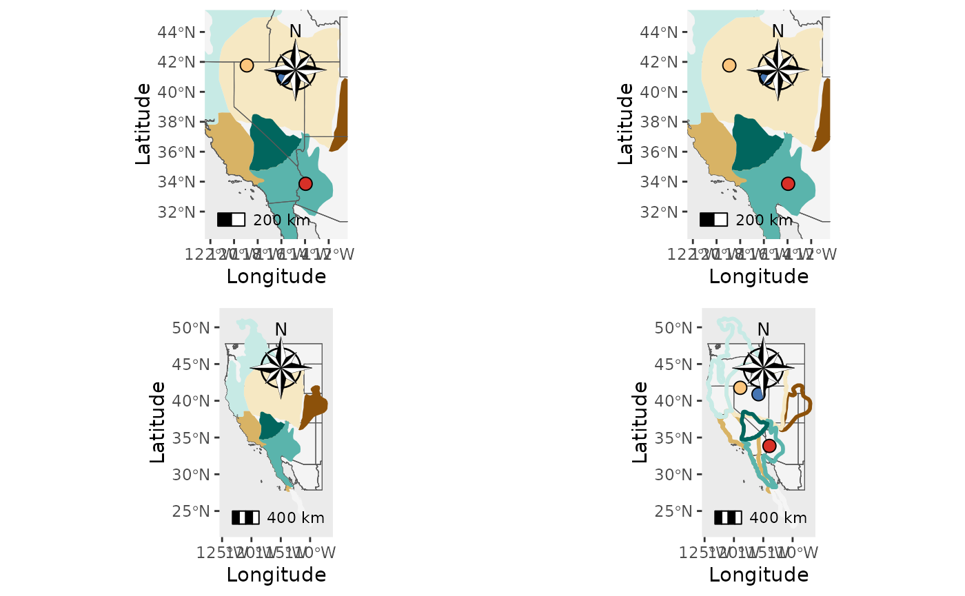
Next, let’s add a raster. Remember that funky things can happen with
terra interpreting your raster as discrete or continous.
Use the discrete_raster arugment to get around this.
PM_ras1 <- Point_map(Het_dat, statistic = "Heterozygosity", Longitude_col = 4, Latitude_col = 5, country_code = c("usa", "mex", "can"), raster = raster, raster_plot_position = 1, interpolate_raster = TRUE, Lat_buffer = 3, Long_buffer = 3, discrete_raster = TRUE,
raster_col = c('white','#ffffcc','#ffeda0','#fed976','#feb24c','#fd8d3c','#fc4e2a','#e31a1c','#bd0026','#800026'), raster_breaks = c(0,500,1000,1500,2000,2500,3000,3500,4000,5000), legend_pos = "right", scale_bar = TRUE, north_arrow_position = "tr", north_arrow = TRUE)
PM_ras2 <- Point_map(Het_dat, statistic = "Heterozygosity", Longitude_col = 4, Latitude_col = 5, country_code = c("usa", "mex", "can"), raster = raster, raster_plot_position = 2, interpolate_raster = TRUE, Lat_buffer = 3, Long_buffer = 3, discrete_raster = TRUE,
raster_col = c('white','#ffffcc','#ffeda0','#fed976','#feb24c','#fd8d3c','#fc4e2a','#e31a1c','#bd0026','#800026'), raster_breaks = c(0,500,1000,1500,2000,2500,3000,3500,4000,5000), legend_pos = "right", scale_bar = TRUE, north_arrow_position = "tr", north_arrow = TRUE)
PM_ras3 <- Point_map(Het_dat, statistic = "Heterozygosity", Longitude_col = 4, Latitude_col = 5, country_code = c("usa", "mex", "can"), raster = raster, raster_plot_position = 3, interpolate_raster = TRUE, Lat_buffer = 3, Long_buffer = 3, discrete_raster = TRUE,
raster_col = c('white','#ffffcc','#ffeda0','#fed976','#feb24c','#fd8d3c','#fc4e2a','#e31a1c','#bd0026','#800026'), raster_breaks = c(0,500,1000,1500,2000,2500,3000,3500,4000,5000), legend_pos = "right", scale_bar = TRUE, north_arrow_position = "tr", north_arrow = TRUE)
plot_grid(PM_ras1$`Heterozygosity Map`, PM_ras2$`Heterozygosity Map`, PM_ras3$`Heterozygosity Map`)## Scale on map varies by more than 10%, scale bar may be inaccurate
## Scale on map varies by more than 10%, scale bar may be inaccurate
## Scale on map varies by more than 10%, scale bar may be inaccurate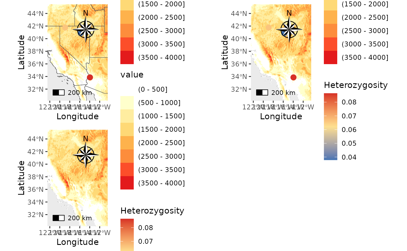
PM_temp <- Point_map(Het_dat, statistic = "Heterozygosity", Longitude_col = 4, Latitude_col = 5, country_code = c("usa", "mex", "can"), raster = raster, raster_plot_position = 3, interpolate_raster = TRUE, Lat_buffer = 3, Long_buffer = 3, discrete_raster = FALSE,
raster_col = c('white','#ffffcc','#ffeda0','#fed976','#feb24c','#fd8d3c','#fc4e2a','#e31a1c','#bd0026','#800026'), legend_pos = "right", scale_bar = TRUE, north_arrow_position = "tr", north_arrow = TRUE)
PM_temp_wbreaks <- Point_map(Het_dat, statistic = "Heterozygosity", Longitude_col = 4, Latitude_col = 5, country_code = c("usa", "mex", "can"), raster = temp_ras, raster_plot_position = 1, interpolate_raster = TRUE, Lat_buffer = 3, Long_buffer = 3, discrete_raster = FALSE,
raster_col = c('white','#ffffcc','#ffeda0','#fed976','#feb24c','#fd8d3c','#fc4e2a','#e31a1c','#bd0026','#800026'), legend_pos = "right", scale_bar = TRUE, north_arrow_position = "tr", north_arrow = TRUE, raster_breaks = c(-15, -10, -5,-2.5, 0,2.5, 5, 10, 15, 20))
plot_grid(PM_temp$`Heterozygosity Map`, PM_temp_wbreaks$`Heterozygosity Map`)## Scale on map varies by more than 10%, scale bar may be inaccurate
## Scale on map varies by more than 10%, scale bar may be inaccurate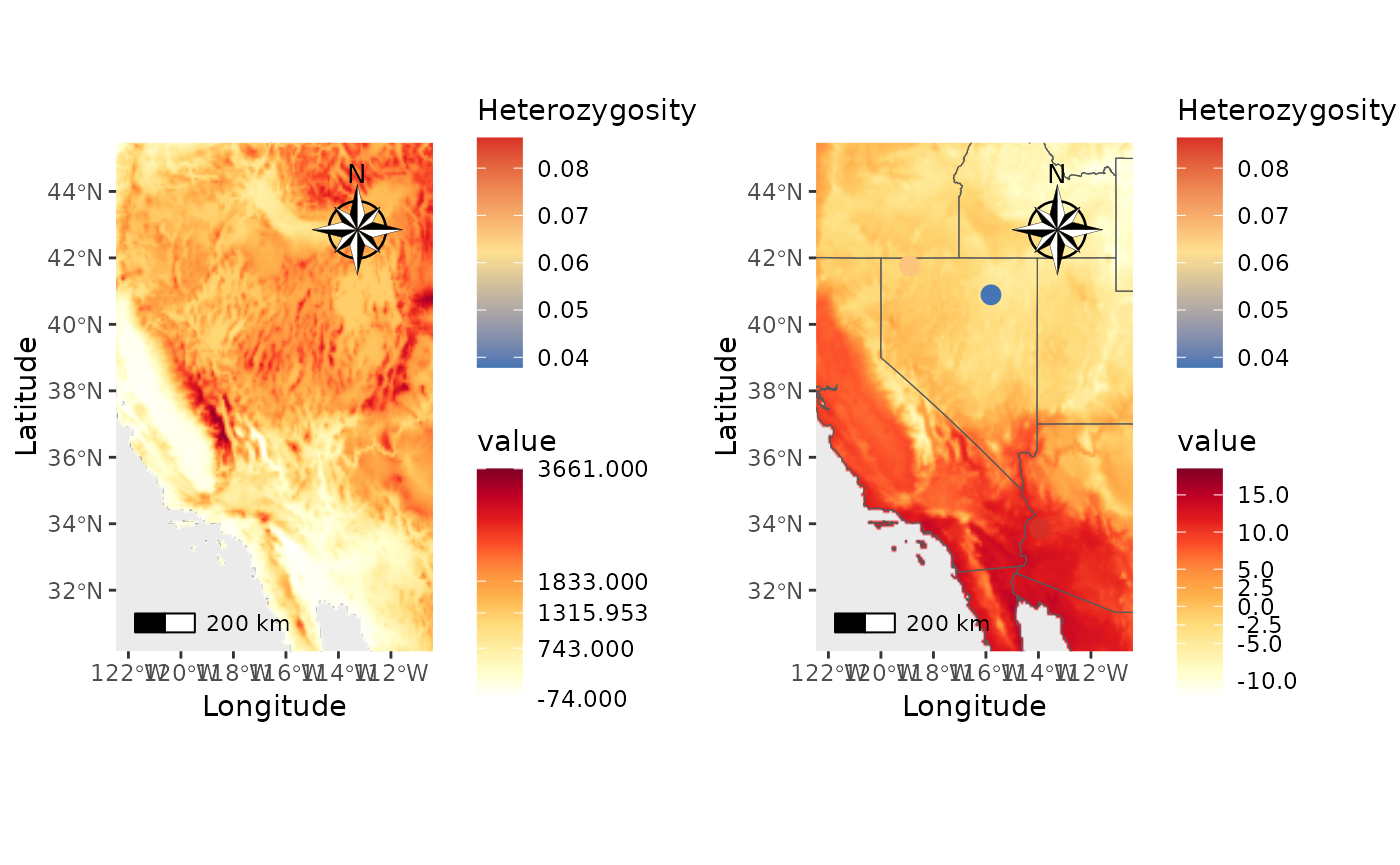
Finally, add shapefiles and a raster.
PM_ras_shp <- Point_map(Het_dat, statistic = "Heterozygosity", Longitude_col = 4, Latitude_col = 5, country_code = c("usa", "mex", "can"), shapefile = shapefiles, shapefile_plot_position = 1, raster = raster, raster_plot_position = 2, interpolate_raster = TRUE, Lat_buffer = 3, Long_buffer = 3, discrete_raster = TRUE, shapefile_outline_col = c('#8c510a','#d8b365','#f6e8c3','#f5f5f5','#c7eae5','#5ab4ac','#01665e'), raster_col = c('white','#ffffcc','#ffeda0','#fed976','#feb24c','#fd8d3c','#fc4e2a','#e31a1c','#bd0026','#800026'), raster_breaks = c(0,500,1000,1500,2000,2500,3000,3500,4000,5000), legend_pos = "right", scale_bar = TRUE, north_arrow_position = "tr", north_arrow = TRUE, shp_outwidth = 2)
PM_ras_shp$`Heterozygosity Map`## Scale on map varies by more than 10%, scale bar may be inaccurate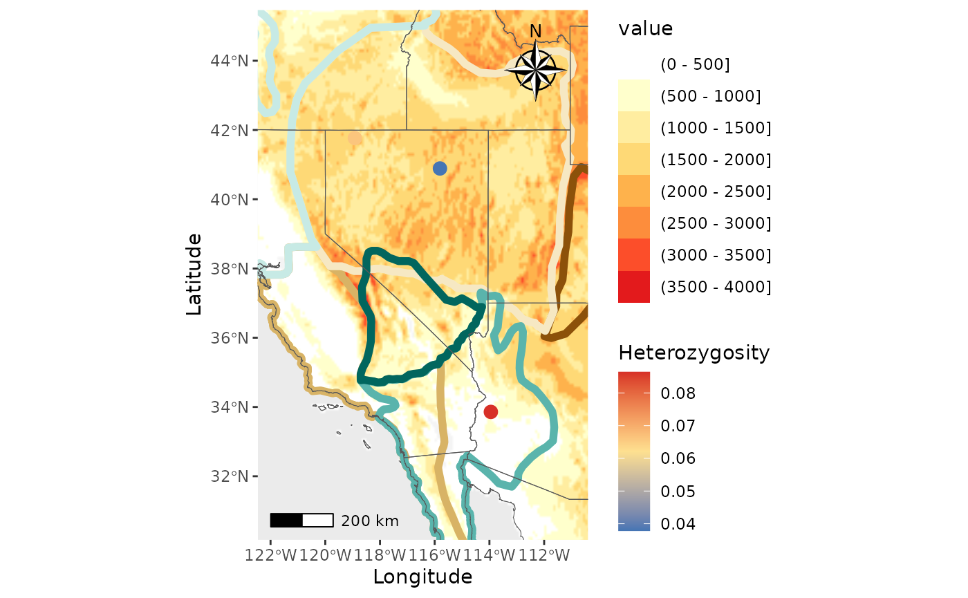
Network map
Users can now add shapefiles and rasters to the maps output by
Network_map, along with north arrows and scale bars. This
function has also been updated to fix a bug that removed sites if they
had a statistic of 0 (i.e, Fst = 0). Originally, this was to remove
localities mapping with themselves; now we remove these instances using
matching names.
First, let’s create a basic map with just the edges and point.
Base_NM <- Network_map(Fst_dat[[1]], pops = Fst_dat[[2]], neighbors = 2, statistic = "Fst", Lat_buffer = 3, Long_buffer = 3,country_code = c("usa", "mex", "can"))## Warning in spdep::knearneigh(Coords, k = neighbors, longlat = TRUE, use_kd_tree
## = FALSE): k greater than one-third of the number of data points
Base_NM$Map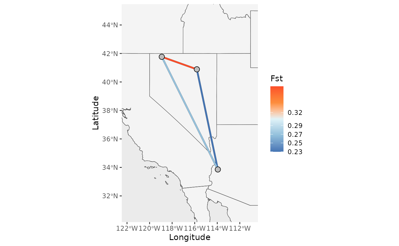
# Specify a comparison using population names
Base_NM_comp <- Network_map(Fst_dat[[1]], pops = Fst_dat[[2]], neighbors = "South_West", statistic = "Fst", Lat_buffer = 3, Long_buffer = 3,country_code = c("usa", "mex", "can"))
plot_grid(Base_NM$Map, Base_NM_comp$Map)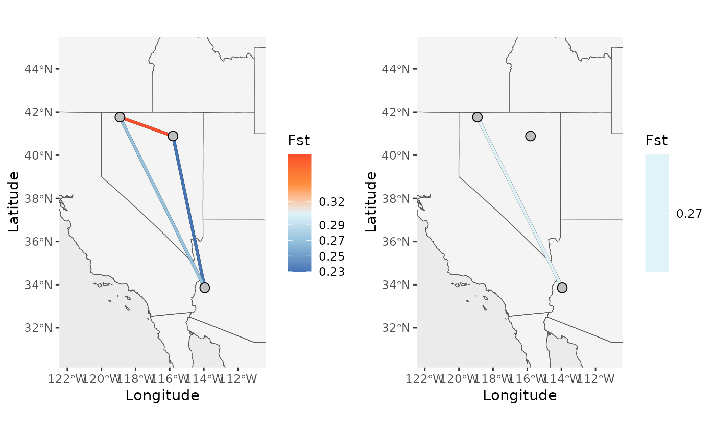
Now, let’s add a shapefile, scale bar, and north arrow.
NM_1 <- Network_map(Fst_dat[[1]], pops = Fst_dat[[2]], neighbors = 2, statistic = "Fst", Lat_buffer = 3, Long_buffer = 3,country_code = c("usa", "mex", "can"), shapefile = shapefiles, shapefile_col = c('#8c510a','#d8b365','#f6e8c3','#f5f5f5','#c7eae5','#5ab4ac','#01665e'), shapefile_plot_position = 1,north_arrow = T, scale_bar = T, north_arrow_position = "tr", shapefile_outline_col = NA)## Warning in spdep::knearneigh(Coords, k = neighbors, longlat = TRUE, use_kd_tree
## = FALSE): k greater than one-third of the number of data points
NM_2 <- Network_map(Fst_dat[[1]], pops = Fst_dat[[2]], neighbors = 2, statistic = "Fst", Lat_buffer = 3, Long_buffer = 3,country_code = c("usa", "mex", "can"), shapefile = shapefiles, shapefile_col = c('#8c510a','#d8b365','#f6e8c3','#f5f5f5','#c7eae5','#5ab4ac','#01665e'), shapefile_plot_position = 2,north_arrow = T, scale_bar = T, north_arrow_position = "tr", shapefile_outline_col = NA)## Warning in spdep::knearneigh(Coords, k = neighbors, longlat = TRUE, use_kd_tree
## = FALSE): k greater than one-third of the number of data points
NM_3 <- Network_map(Fst_dat[[1]], pops = Fst_dat[[2]], neighbors = 2, statistic = "Fst", Lat_buffer = 3, Long_buffer = 3,country_code = c("usa", "mex", "can"), shapefile = shapefiles, shapefile_col = c('#8c510a','#d8b365','#f6e8c3','#f5f5f5','#c7eae5','#5ab4ac','#01665e'), shapefile_plot_position = 3,north_arrow = T, scale_bar = T, north_arrow_position = "tr", shapefile_outline_col = NA)## Warning in spdep::knearneigh(Coords, k = neighbors, longlat = TRUE, use_kd_tree
## = FALSE): k greater than one-third of the number of data points## Coordinate system already present.
## ℹ Adding new coordinate system, which will replace the existing one.
NM_4 <- Network_map(Fst_dat[[1]], pops = Fst_dat[[2]], neighbors = 2, statistic = "Fst", Lat_buffer = 3, Long_buffer = 3,country_code = c("usa", "mex", "can"), shapefile = shapefiles, shapefile_outline_col = c('#8c510a','#d8b365','#f6e8c3','#f5f5f5','#c7eae5','#5ab4ac','#01665e'), shapefile_plot_position = 1,north_arrow = T, scale_bar = T, north_arrow_position = "tr", shp_outwidth = 2)## Warning in spdep::knearneigh(Coords, k = neighbors, longlat = TRUE, use_kd_tree
## = FALSE): k greater than one-third of the number of data points
plot_grid(NM_1$Map, NM_2$Map, NM_3$Map, NM_4$Map)## Scale on map varies by more than 10%, scale bar may be inaccurate
## Scale on map varies by more than 10%, scale bar may be inaccurate
## Scale on map varies by more than 10%, scale bar may be inaccurate
## Scale on map varies by more than 10%, scale bar may be inaccurate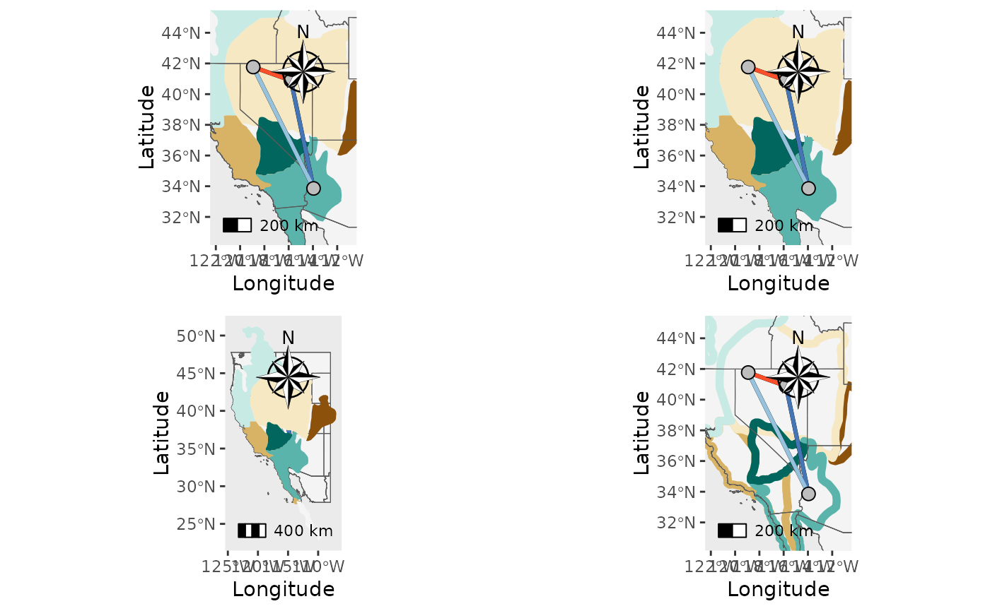
Next, let’s add a raster.
NM_ras1 <- Network_map(Fst_dat[[1]], pops = Fst_dat[[2]], statistic = "Fst", neighbors = 2, country_code = c("usa", "mex", "can"), raster = raster, raster_plot_position = 1, interpolate_raster = TRUE, Lat_buffer = 3, Long_buffer = 3, discrete_raster = TRUE,
raster_col = c('white','#ffffcc','#ffeda0','#fed976','#feb24c','#fd8d3c','#fc4e2a','#e31a1c','#bd0026','#800026'), raster_breaks = c(0,500,1000,1500,2000,2500,3000,3500,4000,5000), legend_pos = "right", scale_bar = TRUE, north_arrow_position = "tr", north_arrow = TRUE)## Warning in spdep::knearneigh(Coords, k = neighbors, longlat = TRUE, use_kd_tree
## = FALSE): k greater than one-third of the number of data points
NM_ras2 <- Network_map(Fst_dat[[1]], pops = Fst_dat[[2]], statistic = "Fst",neighbors = 2, country_code = c("usa", "mex", "can"), raster = raster, raster_plot_position = 2, interpolate_raster = TRUE, Lat_buffer = 3, Long_buffer = 3, discrete_raster = TRUE,
raster_col = c('white','#ffffcc','#ffeda0','#fed976','#feb24c','#fd8d3c','#fc4e2a','#e31a1c','#bd0026','#800026'), raster_breaks = c(0,500,1000,1500,2000,2500,3000,3500,4000,5000), legend_pos = "right", scale_bar = TRUE, north_arrow_position = "tr", north_arrow = TRUE)## Warning in spdep::knearneigh(Coords, k = neighbors, longlat = TRUE, use_kd_tree
## = FALSE): k greater than one-third of the number of data points
NM_ras3 <- Network_map(Fst_dat[[1]], pops = Fst_dat[[2]], statistic = "Fst", neighbors = 2, country_code = c("usa", "mex", "can"), raster = raster, raster_plot_position = 3, interpolate_raster = TRUE, Lat_buffer = 3, Long_buffer = 3, discrete_raster = TRUE,
raster_col = c('white','#ffffcc','#ffeda0','#fed976','#feb24c','#fd8d3c','#fc4e2a','#e31a1c','#bd0026','#800026'), raster_breaks = c(0,500,1000,1500,2000,2500,3000,3500,4000,5000), legend_pos = "right", scale_bar = TRUE, north_arrow_position = "tr", north_arrow = TRUE)## Warning in spdep::knearneigh(Coords, k = neighbors, longlat = TRUE, use_kd_tree
## = FALSE): k greater than one-third of the number of data points
plot_grid(NM_ras1$Map, NM_ras2$Map, NM_ras3$Map)## Scale on map varies by more than 10%, scale bar may be inaccurate
## Scale on map varies by more than 10%, scale bar may be inaccurate
## Scale on map varies by more than 10%, scale bar may be inaccurate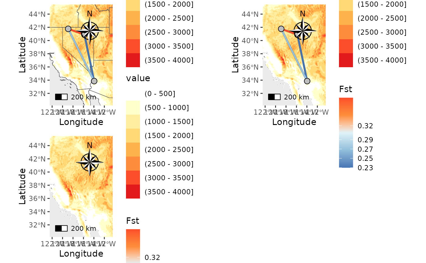
NM_temp <-  Network_map(Fst_dat[[1]], pops = Fst_dat[[2]],  statistic = "Fst",  neighbors = 2, country_code = c("usa", "mex", "can"), raster = raster, raster_plot_position = 1, interpolate_raster = TRUE, Lat_buffer = 3, Long_buffer = 3, discrete_raster = FALSE,
raster_col = c('white','#ffffcc','#ffeda0','#fed976','#feb24c','#fd8d3c','#fc4e2a','#e31a1c','#bd0026','#800026'), legend_pos = "right", scale_bar = TRUE, north_arrow_position = "tr", north_arrow = TRUE)
## Warning in spdep::knearneigh(Coords, k = neighbors, longlat = TRUE, use_kd_tree
## = FALSE): k greater than one-third of the number of data points
NM_temp_wbreaks <- Network_map(Fst_dat[[1]], pops = Fst_dat[[2]], statistic = "Fst", neighbors = 2, country_code = c("usa", "mex", "can"), raster = temp_ras, raster_plot_position = 1, interpolate_raster = TRUE, Lat_buffer = 3, Long_buffer = 3, discrete_raster = FALSE,
raster_col = c('white','#ffffcc','#ffeda0','#fed976','#feb24c','#fd8d3c','#fc4e2a','#e31a1c','#bd0026','#800026'), legend_pos = "right", scale_bar = TRUE, north_arrow_position = "tr", north_arrow = TRUE, raster_breaks = c(-15, -10, -5,-2.5, 0,2.5, 5, 10, 15, 20))
## Warning in spdep::knearneigh(Coords, k = neighbors, longlat = TRUE, use_kd_tree
## = FALSE): k greater than one-third of the number of data points
plot_grid(NM_temp$Map, NM_temp_wbreaks$Map)## Scale on map varies by more than 10%, scale bar may be inaccurate
## Scale on map varies by more than 10%, scale bar may be inaccurate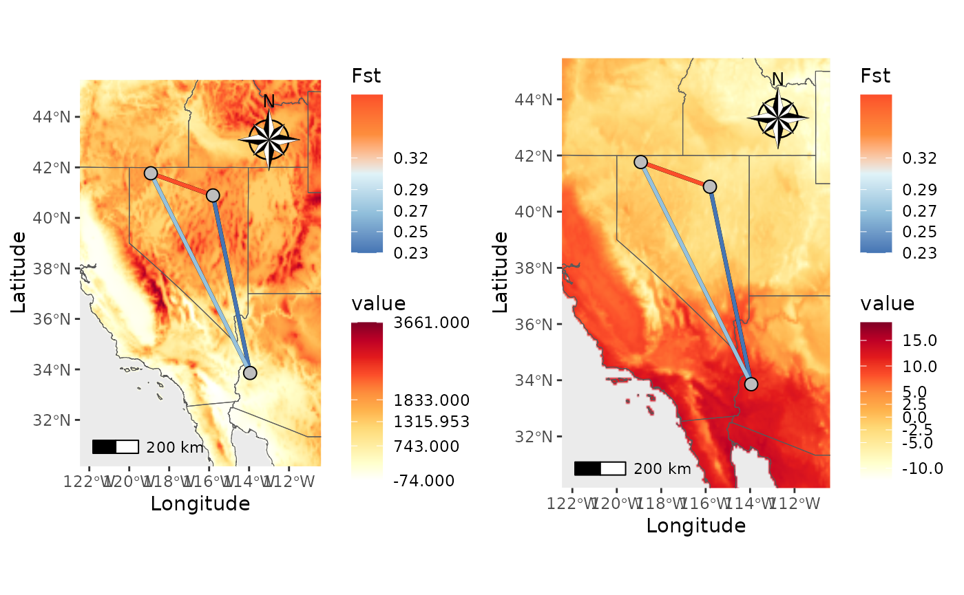
Finally, let’s make a map with both a shapefile and raster.
NM_ras_shp <- Network_map(dat = Fst_dat[[1]], pops = Fst_dat[[2]], statistic = "Fst", neighbors = 2, country_code = c("usa", "mex", "can"), shapefile = shapefiles, shapefile_plot_position = 1, raster = raster, raster_plot_position = 2, interpolate_raster = TRUE, Lat_buffer = 3, Long_buffer = 3, discrete_raster = TRUE, shapefile_outline_col = c('#8c510a','#d8b365','#f6e8c3','#f5f5f5','#c7eae5','#5ab4ac','#01665e'), raster_col = c('white','#ffffcc','#ffeda0','#fed976','#feb24c','#fd8d3c','#fc4e2a','#e31a1c','#bd0026','#800026'), raster_breaks = c(0,500,1000,1500,2000,2500,3000,3500,4000,5000), legend_pos = "right", scale_bar = TRUE, north_arrow_position = "tr", north_arrow = TRUE, shp_outwidth = 2)## Warning in spdep::knearneigh(Coords, k = neighbors, longlat = TRUE, use_kd_tree
## = FALSE): k greater than one-third of the number of data points
NM_ras_shp$Map## Scale on map varies by more than 10%, scale bar may be inaccurate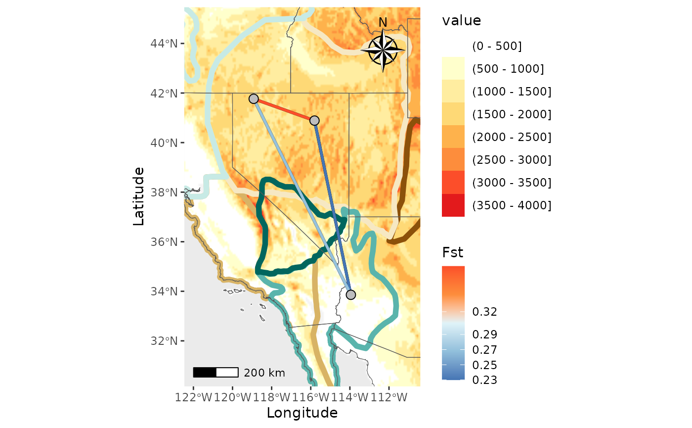
Pairwise heatmap
Users now have more freedom to control the color gradient.
Base_PH <- Pairwise_heatmap(Fst_dat[[1]], statistic = "Fst")

PH_wbreaks <- Pairwise_heatmap(Fst_dat[[1]], statistic = "Fst", breaks = c(0.2,0.225,0.25,0.3,0.38))

plot_grid(Base_PH, PH_wbreaks)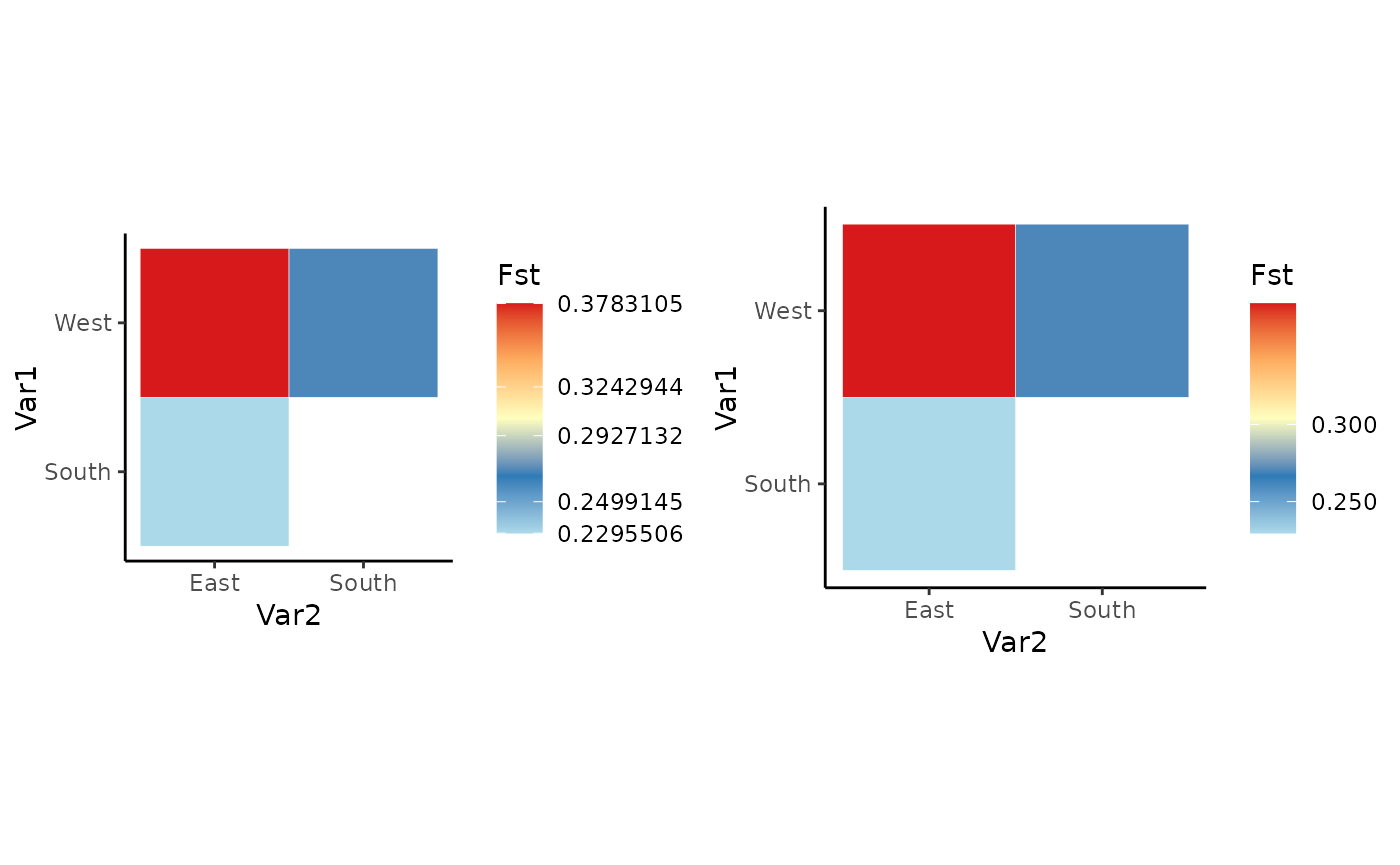
Thank you for your interest in our package and for reading through all of this. Please reach out if you have any questions or suggestions that could help make the package better.